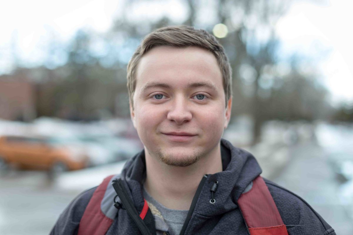
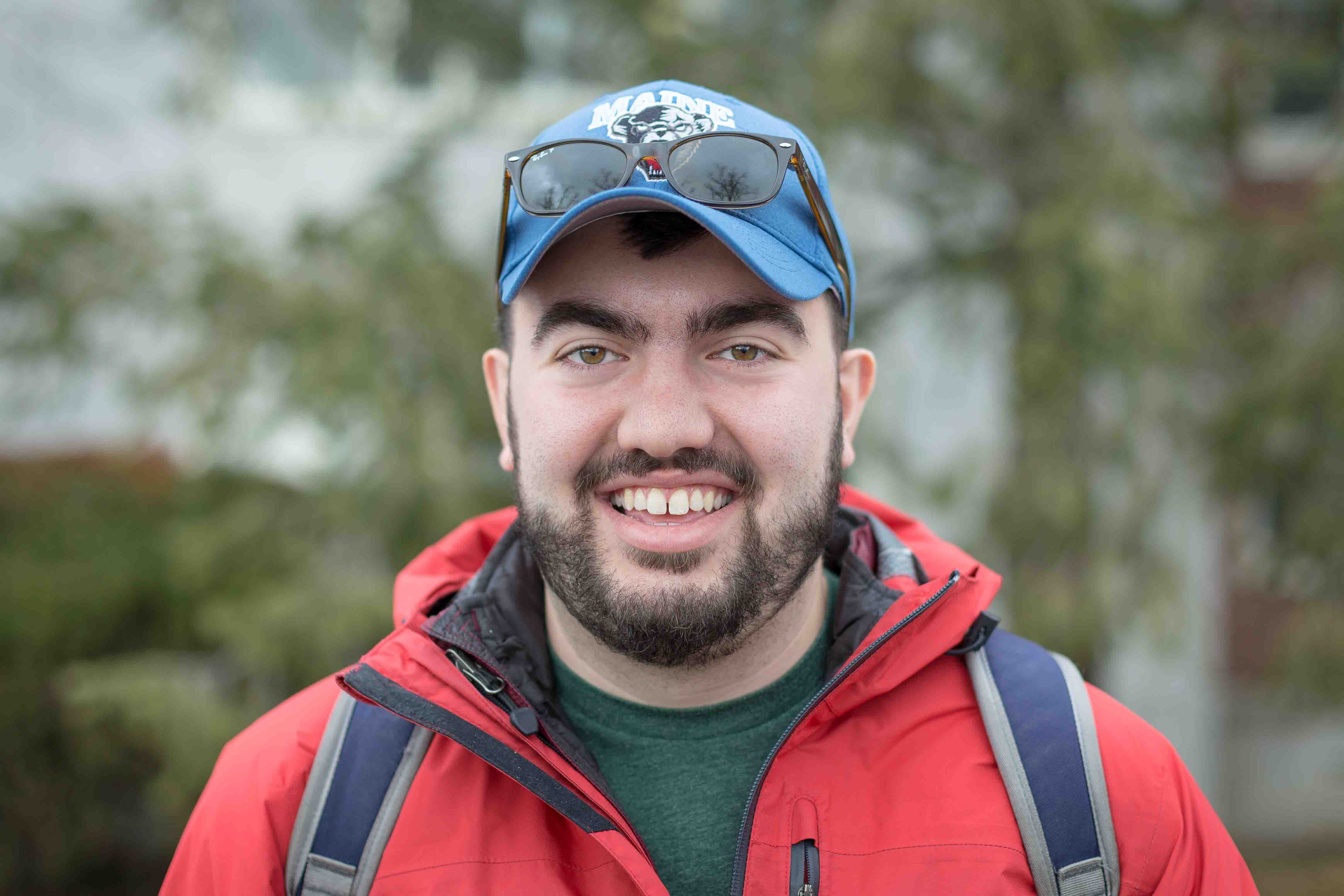
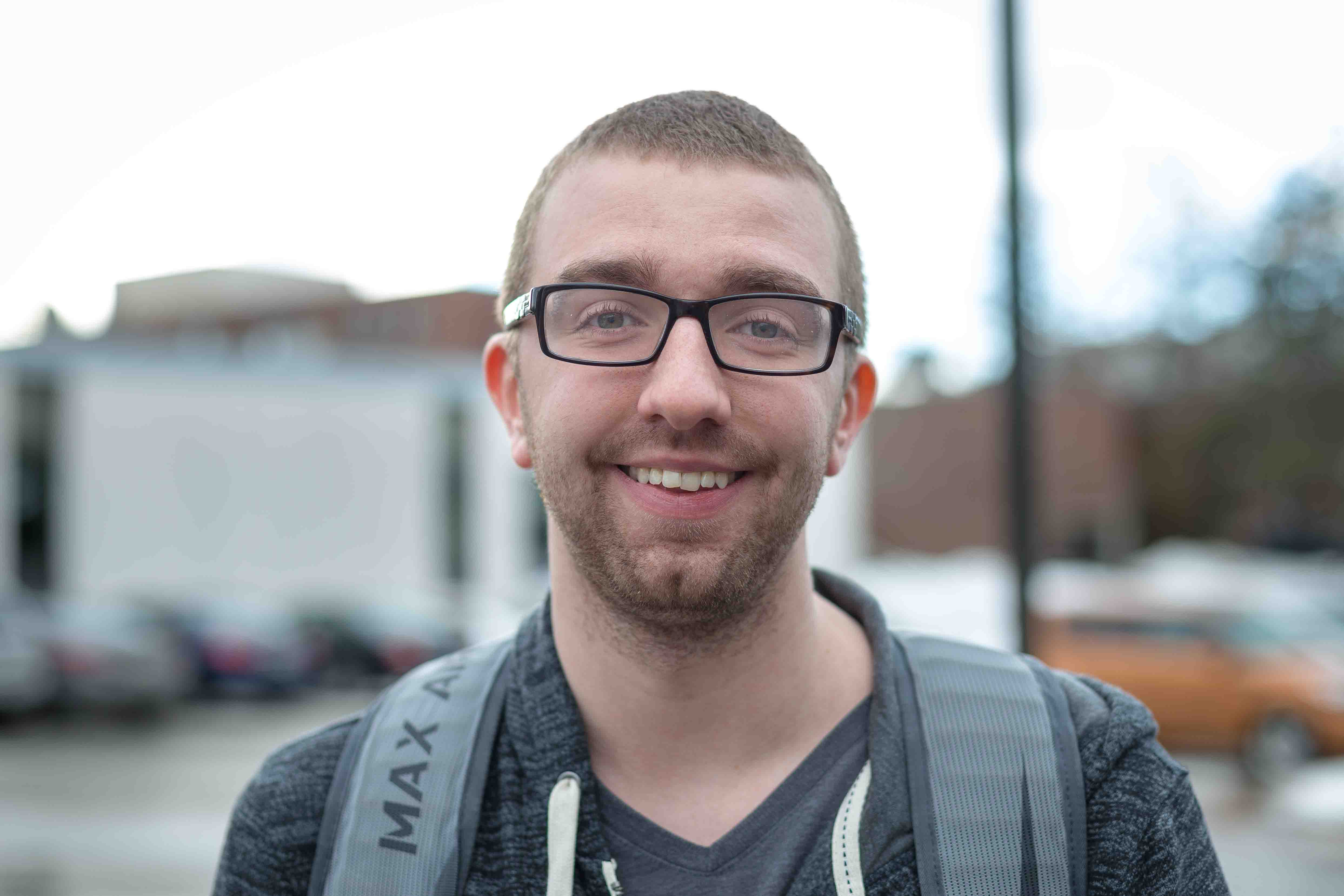
For this assignment I just wanted to take basic portraits – I wasn’t trying to go with anything fancy because I actually prefer a basic portrait over something more elaborate. One thing I found interested was that if someone was on their phone when I approached them, they were more likely to say no. If they were walking without headphones and looking up when they were walking, it was easier for them to see me coming and it was a better interaction. Regardless, it certainly forced me out of my comfort zone.

February 6, 2018 at 3:21 pm
The third photo is my favourite face that was photographed. I do like all of them, as they all have a great depth of field, but I think that one really speaks to me because of the vibrant colour. The subject is colourful, but it also goes very well with the background as well. The background seems like a backdrop, not a photo just taken on the street.
February 6, 2018 at 3:28 pm
I really enjoy your first and last photo. Overall all of your photos have a really great contrast of depth of field between the person and the background. It really stands out in all of your photos and it’s clear to see that it’s something you have done and practiced before. I particularly enjoy the first and last photo because they feel like almost opposites to each other. With one, you have a younger, happier looking person. And on the other side, you have an older, more stern looking man. I think there’s a lot of subtle contrasts between the two that are very appealing to compare to each other. Good job!
February 7, 2018 at 2:09 am
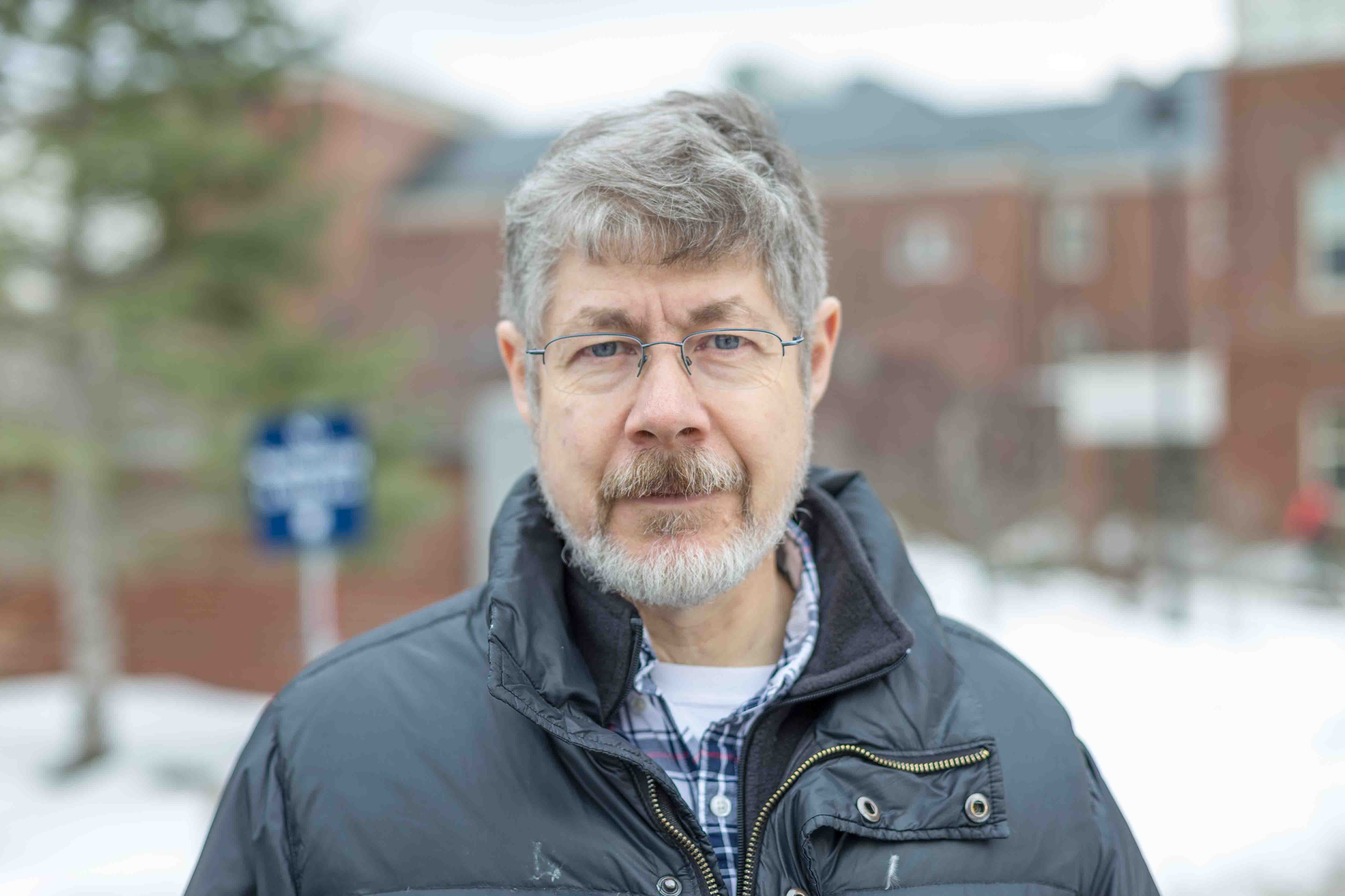
Tate, these portraits are truly well done. The stark contrast between the sharp focus of the faces and the bokeh effect in the background really allows a concentration of each individual’s expressions. They are unique and provide subtle insight into each person’s personality. Additionally, even though the focus is sharp on their faces, the outdoor light and exposure provide a soft, clear and bright light on their faces that is pleasing to look at. Well done!
February 7, 2018 at 5:17 pm
Tate, all of these photos grab my attention. The focus of the subjects in the pictures with the blurred back drops goes really well together. The uncofucsed backdrops make the people in the picture look really sharp. It’s almost like each picture you took tells a different story. The framing is perfect your eyes are instantly drawn to each person. Each person seems to tell a different story with their expressions. Great work!
February 8, 2018 at 3:58 am
These are beautiful portraits as the focus is truly on their faces and the camera settings are set perfectly. The blurry background prevents me from moving my eyes anywhere off of their faces which is quite interesting. Almost like a barrier. I enjoy their expressions as well. Some are serious, some are happy, all depends on the time you took the pictures and how that person’s day was going at that time.
February 13, 2018 at 5:40 pm
Tate,
All of your portraits are exeptionally clear and crisp. If I were any of these people I would have asked for a copy to be sent to me! Seeing strangers in such different moods makes me think about where they were going or what the encounter with a photographer was like for them.
February 22, 2018 at 2:44 am
Content–The repetition of colored backpack straps & age of people tells me this is a student series…I like the visual variety of colors of shirt/straps; i think these make a set with the prof bit out of place. unless there’s a linking story, like these are all his students…
Composition–similar composition allow us to note the significant difference; this may work well as a slide show
Technique–basic in focus with soft bokeh in background, so smiling faces stand out
Aesthetics–I like best the “variations on a theme” motif, with those backpack straps shifting colors; might be better if all the students were set against evergreen background; and just prof in front of brick…