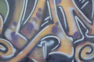
Orono – Walking around downtown Orono, I ended up at this spot where there was some graffiti that was colorful and interesting, so I forced myself to stop and take some photos, and look around to see what else there was.
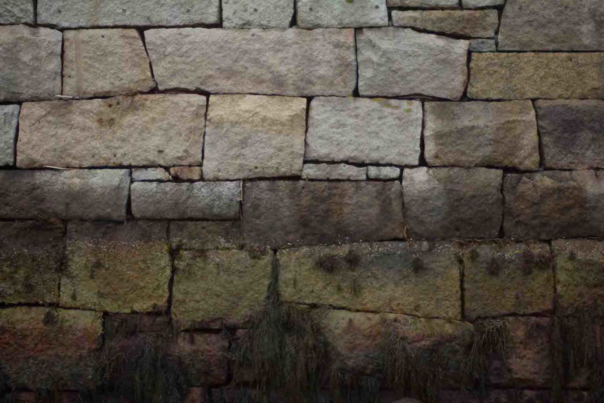
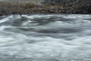
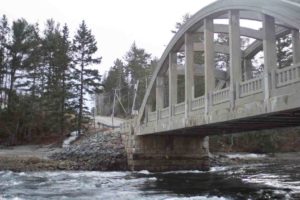
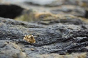
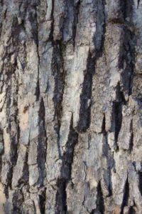
Reversing Falls – Back in my home town of Blue Hill, theres a beautiful old bridge that hovers above the “reversing falls,” where the current actually switches when the tide comes in and out. There are some nice natural features, and just before I left, I thankfully looked behind me and saw the rock wall pattern that had been darkened on the bottom half by the tide.


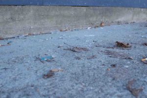
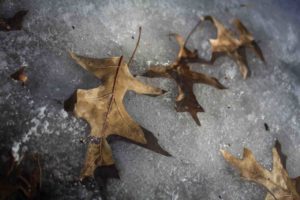
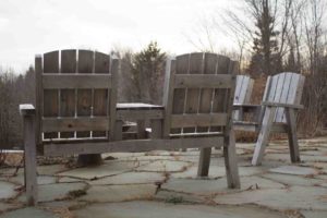
Park – Along the Stillwater River is a small park that has some benches next to the water and after standing and looking for a bit, I decided to focus on patterns and the “unnatural” and “natural” aspects of the scene.
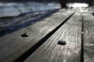
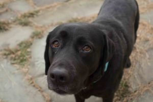
Patio – While dog-sitting I attempted to find some interesting things to photograph on the patio until Andi (the black lab) joined me and forced me to go with the flow – which actually made it much more interesting anyway.
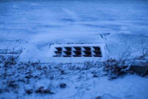
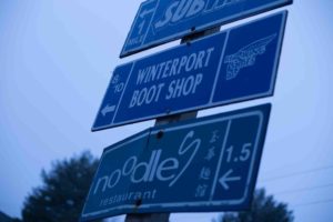
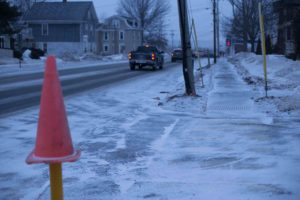
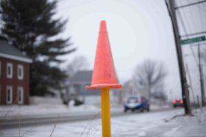
Bus Stop – For my final location, while waiting for the bus I pulled out my camera and forced myself to just shoot with a 50mm lens, so I had to figure out something else other than zooming in. I experimented a little with white balance and also tried to capture the small snow flakes that were falling.
February 8, 2018 at 3:50 am
I really enjoy how each of these galleries have a distinct theme to them. The themes make the set of pictures very appealing and give me the urge to click on them individually to see finer details. The last set of photos make me feel a cold sensation. It could be the 10 inches of snow that is currently falling as I type this but I’m going to stick with the pictures being the reason why I feel cold. Nice work.
February 12, 2018 at 11:08 pm
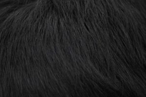
The group with the photo of the dog really speaks to me for some reason. I love how well they all work together. There are nice neutral tones as well as wonderful textures in all of them. I really think the emotions here are a mix of loneliness as well as peace. It seems like a place I wouldn’t mind just being by myself with a dog, just hanging out. I also really love the photo of the dog and how the dog’s body runs out of the photo. It’s an interesting angle and not perfectly centered. The grass photo of the close up just makes me want to reach out a grab it! The textures in that image are really crisp and defined.
The Reversing Falls group is really my favorite out of all of these. I enjoy each of these images on there own as well as together. The tones you have captured here are really amazing. The different colors of that wall are really interesting. I agree with Joline’s earlier comment of bumping up the saturation just slightly to really show them even more. The bridge image is the only one that isn’t as crisp as the other, it’s almost a little foggy. I like it being in the collection because it is the glimpse of the place you captured as a whole. Maybe there is a way to darken it down slightly to reduce the foggy look?
February 12, 2018 at 11:55 pm
Tate, I would have to say my favorite of your photos has to be the close up of the Reversing Falls. The slow shutter speed you used really helped convey the speed of the water. Additionally, by keeping your focus on the gravel, you managed to establish an important thing with this photo. That being how you made this piece feel very “wet.” It sounds weird, saying that water looks wet, but stay with me here. You managed to capture more than just the fluidity of the water. Due to the overcast lighting and the varying moistness of the rocks, I can tell how humid and cold it was by the Reversing Falls. Another neat aspect of this photo is how the perspective can leave the viewer wondering where the photographer stood, which is always fun to play with. To us, it seems like you’re in the middle of the river. Nice work on the finely composed piece.
February 13, 2018 at 3:32 am
I really enjoy how each set is themed according to color. the diversity of the shots is also really enjoyable. You capture earthy tones very well and the texture compliments the color schemes.
February 22, 2018 at 12:33 am
Content–good variety and way of finding variety in same scene; I especially like the textures and patterns in your images–maybe try to play with depth f field when capturing the patterns–how much is in sharp focus, ho mush blends int back;
Composition–It’s the patterns and textures I note most prominent–you have a good eye for this; but I actually like the bridge composition–it’s one of your most dynamic images as far as eye movement over the image goes.
Technique–interesting use of white balance in last set, maybe play with it more in post production? and again play a bit with aperture & DOF
Aesthetics–beginning to see an aesthetic of patter & texture emerge for you; but I’d like to see more for work with composition…
March 1, 2018 at 3:24 am
Content–lots of variety, from rock and seaweed textures, to landscapes, to natural and wild life, to architecture–a nice range for first assignment
Composition–some variety, though most images have subject centered; i like the off angle images most, like the park bench and 3rd snowy street scene w orange cone; the decentered composition draws me in; for this reason my fav is the bridge scene, though its a rather common scene, i am really drawn to it, as well as the colored rock wall of your featured image.
Technique-a fast and slow shutter speed for water; some focus and depth of field choices, and and eye for patterns. may want to adjust white balance in last set f images in LR to see hw they would change.
Aesthetics–still developing, but attentive to patterns in landscape…