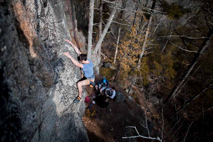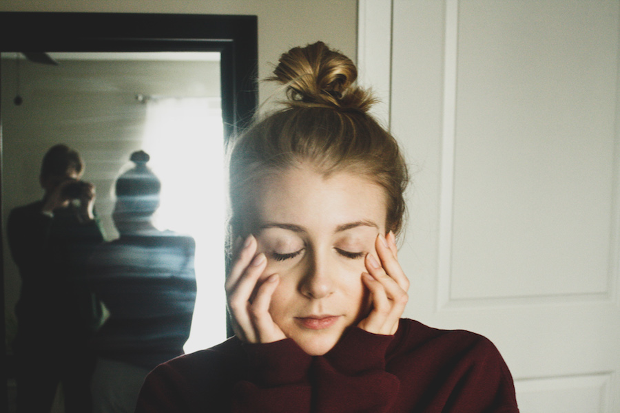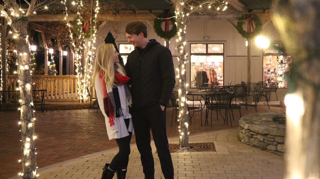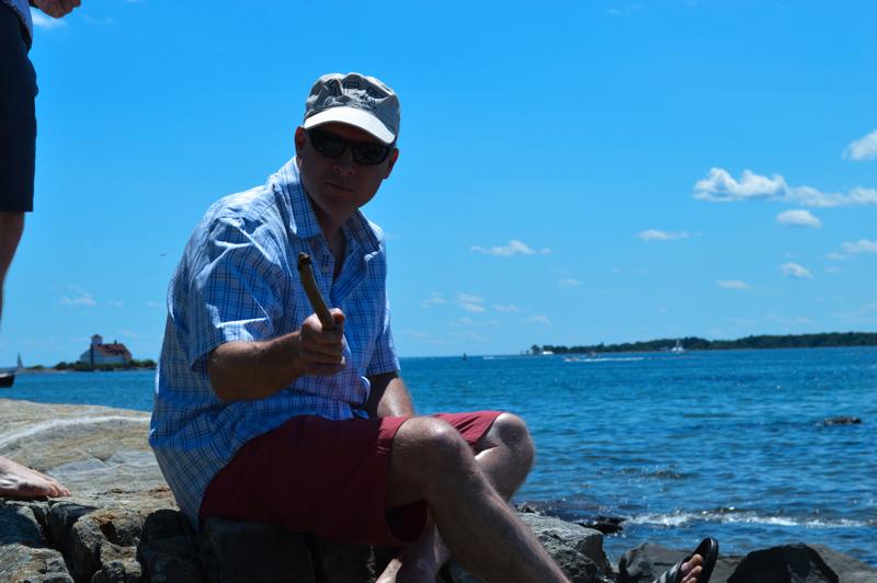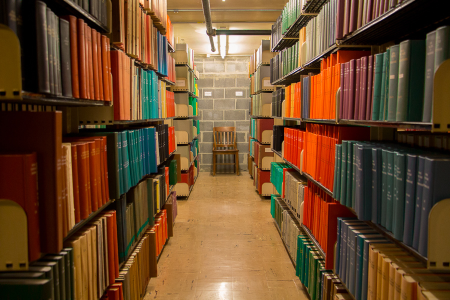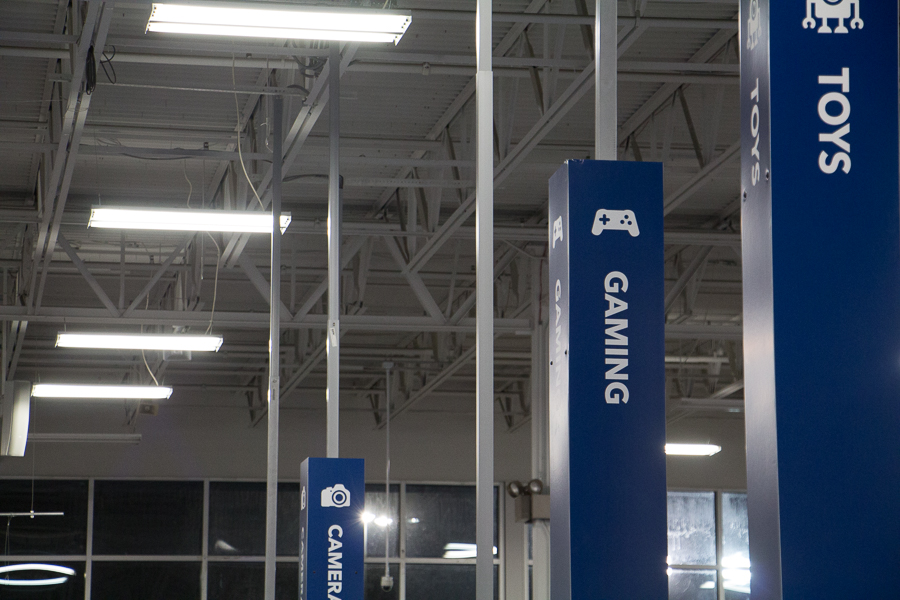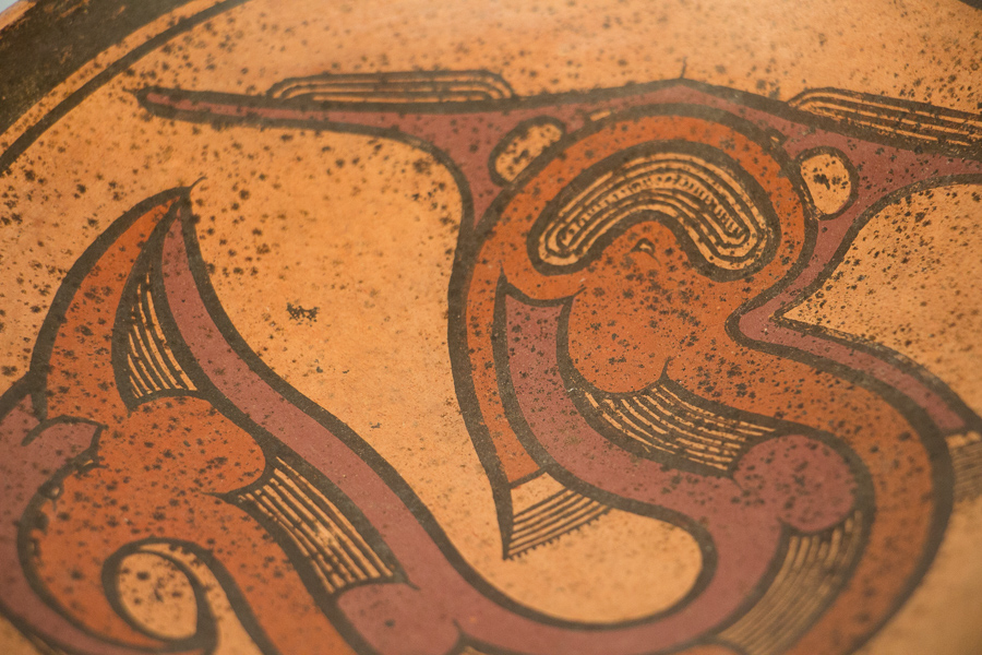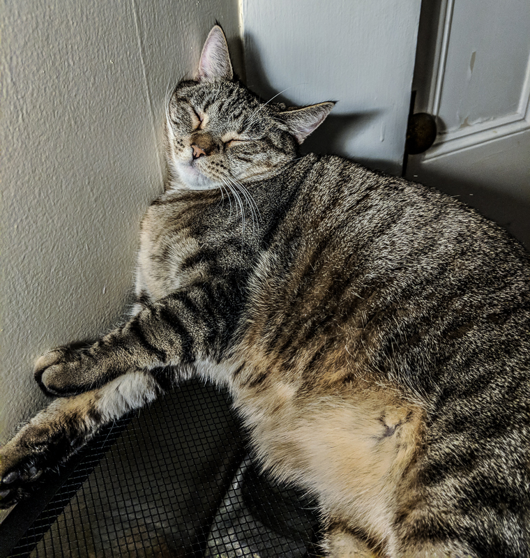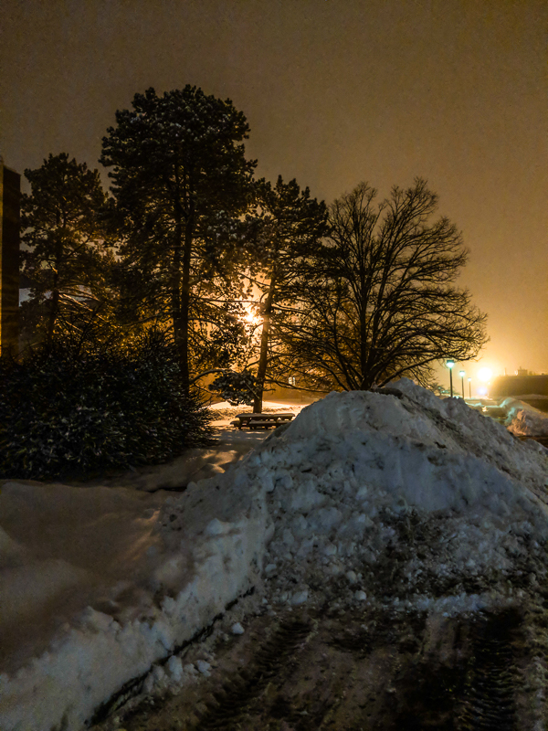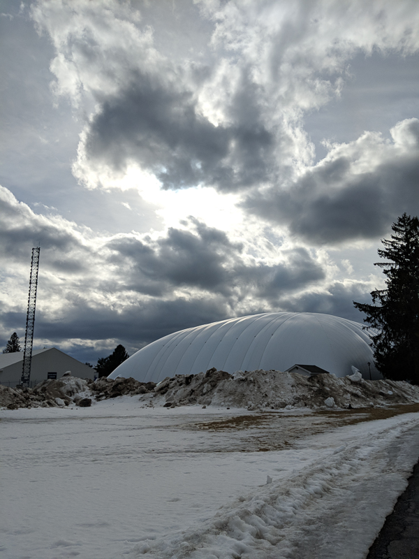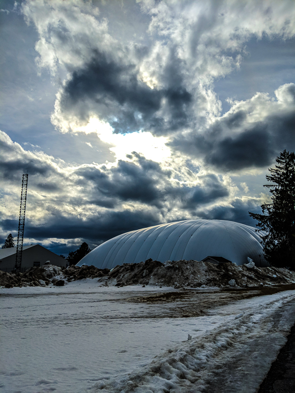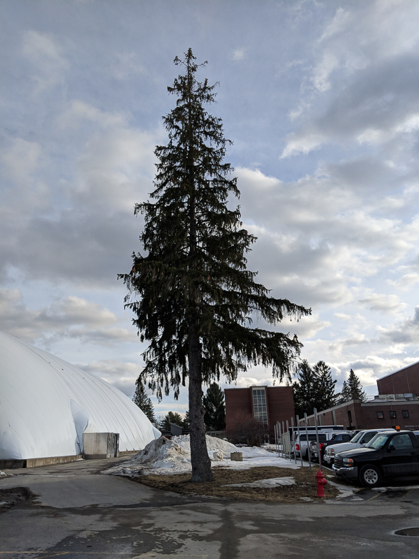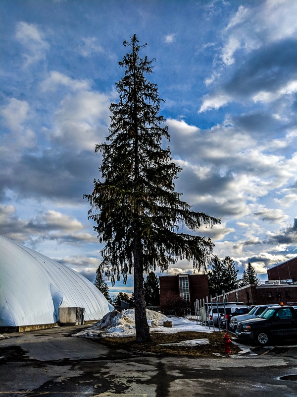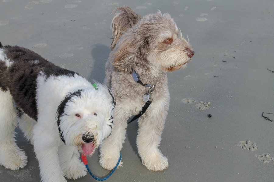


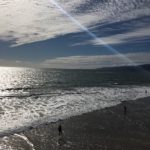
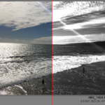
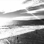

This was my most difficult assingment in this class. It was really difficult for me to learn how to import/export from my computer to lightroom in a way where I could get the 20/20 image. Learning how to use lightroom has been the most difficult portion of this class. After this assingment however, I have a much greater understanding of how lightroom and adobe photoshop operate. I feel as though some of my photos do not always capture the message I was trying to send out.
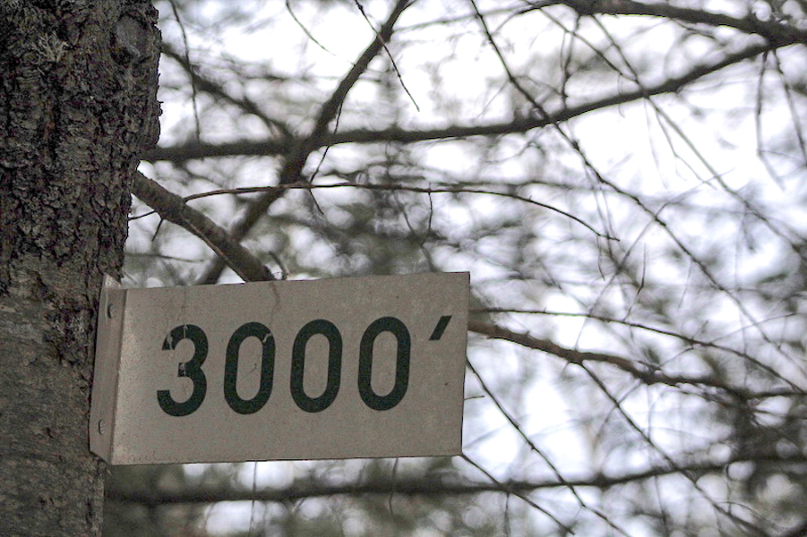
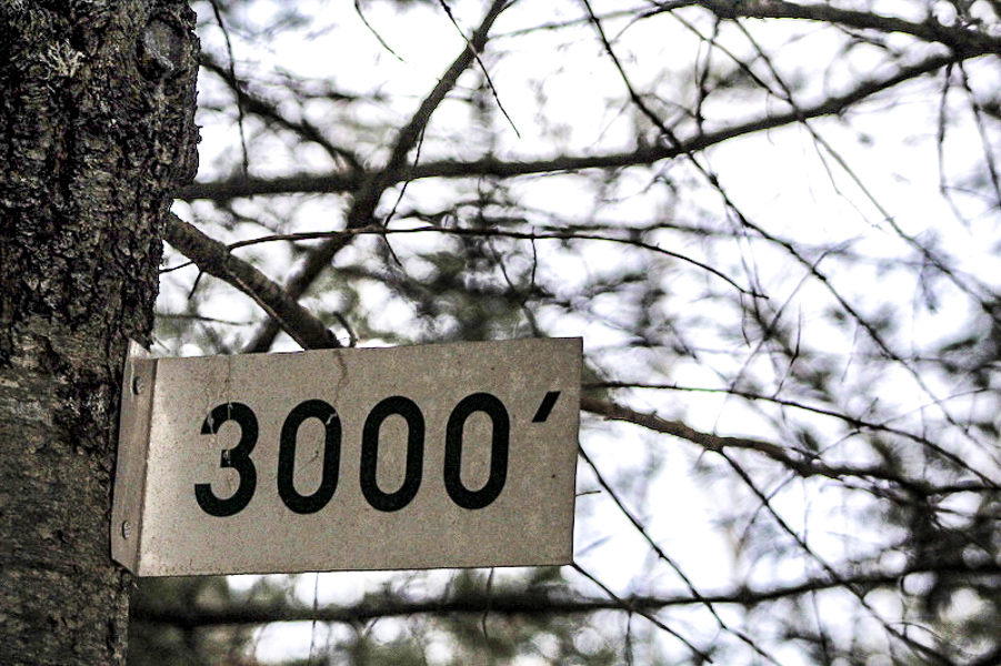
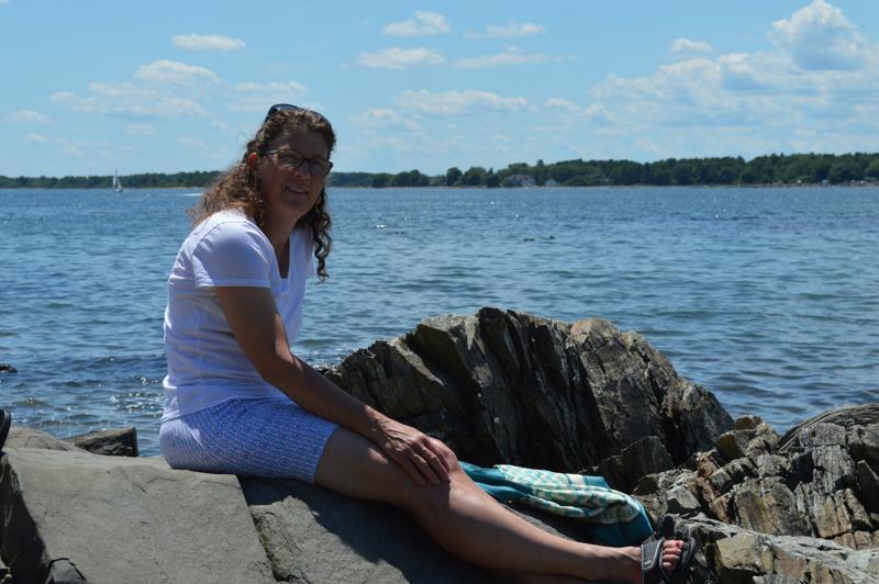
Overall I like to keep my edits pretty minimal unless I’ve dramatically underexposed or overexposed a photo, or I think a heavy edit to create a certain effect might look interesting. I typically brighten the shadows, brighten the whites and darken the blacks, adjust the white balance to what I remember the scene feeling like, and add a little bit of saturation and vibrance. I’ve also been experimenting lately with split-toning and how I can create a “film-like” look if I make the shadows and highlights have a tint that might not be exactly how the scene looked but creates a different feel that mimics how film photography looks to me. I always finish off my photos with adding some sharpness and a slight vignette if I think the photo might need a little more focus on the center of the photo.


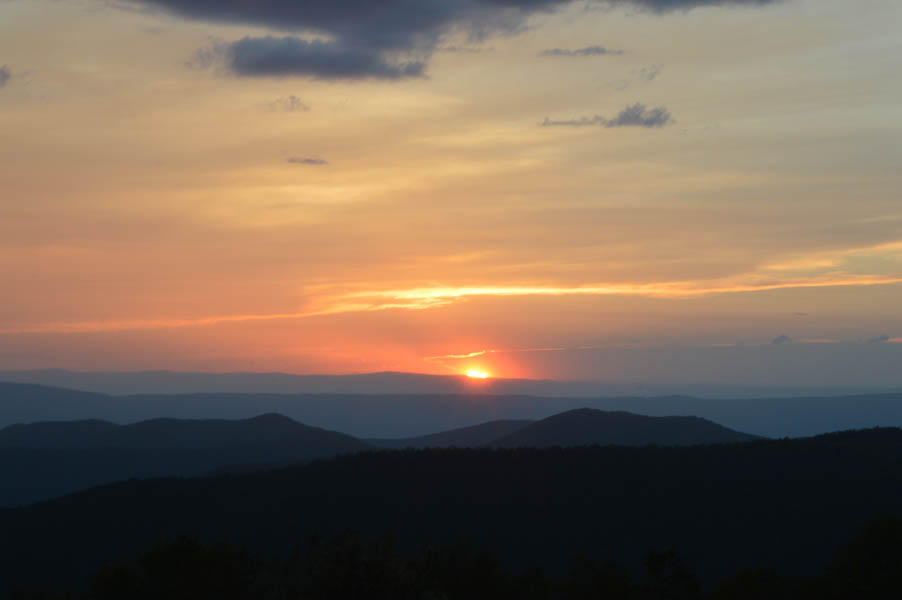
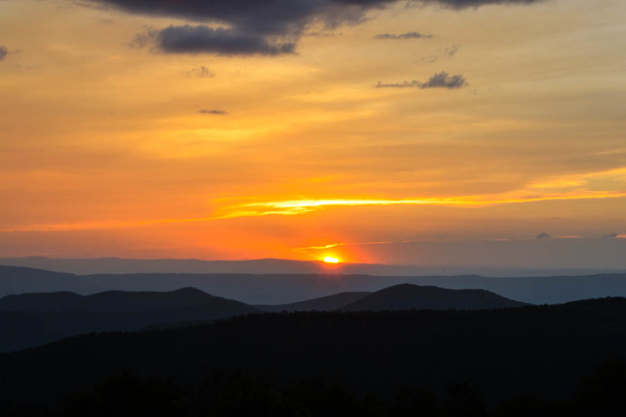
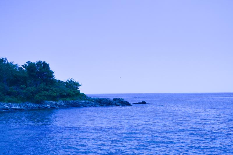
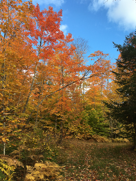
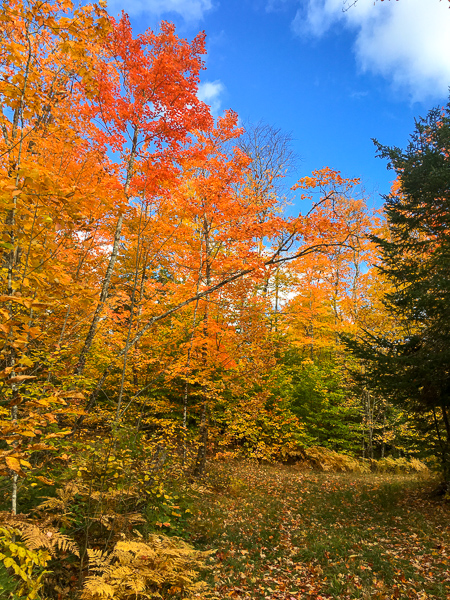
This is a view in Shenandoah last summer — I wanted to capture the vibrancy of the sunset more accurately as it is seen by the eye.
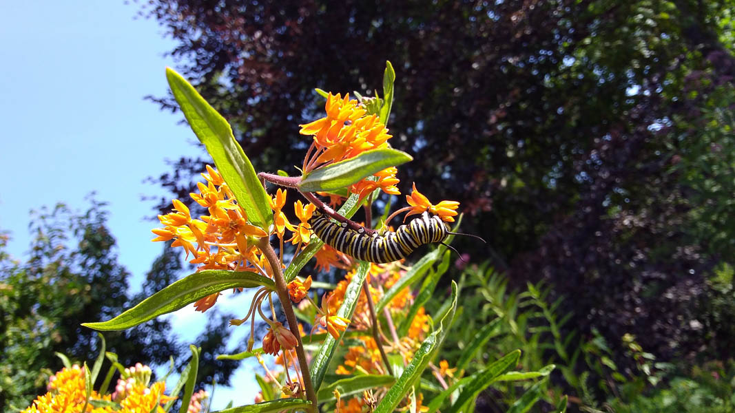
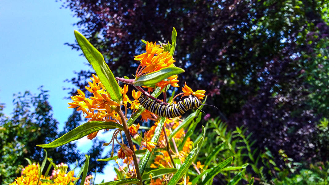
A caterpillar in the Kinsbrae Garden in St. Andrews, NB. Again, I enhanced the colors and contrast to make the image more visually striking as it would appear when you first notice it.
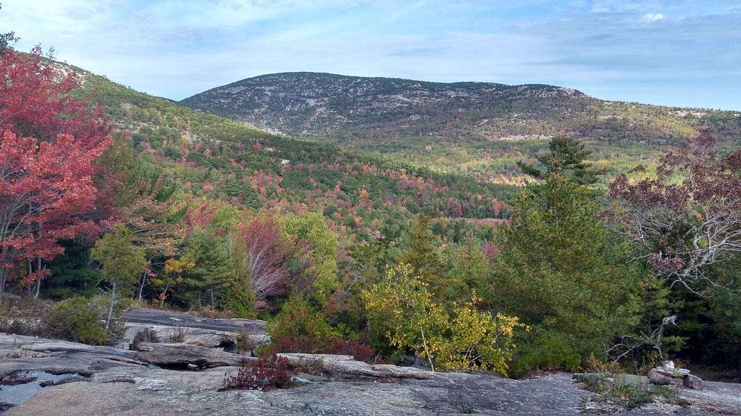
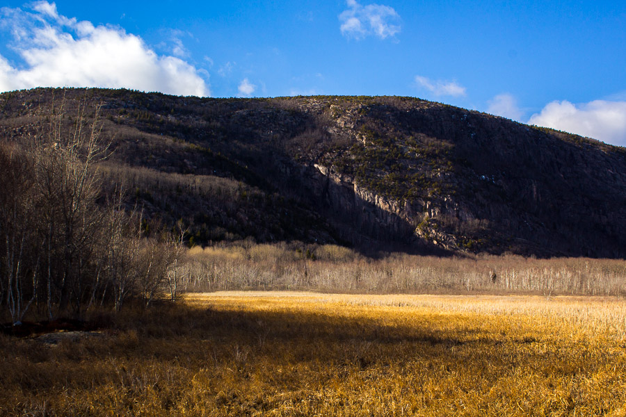
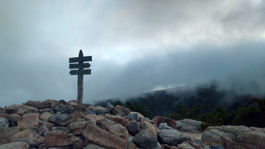
Acadia in early October. Again, some editing makes the colors more natural where the camera settings washed them out in the original photo.
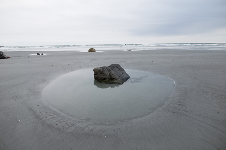
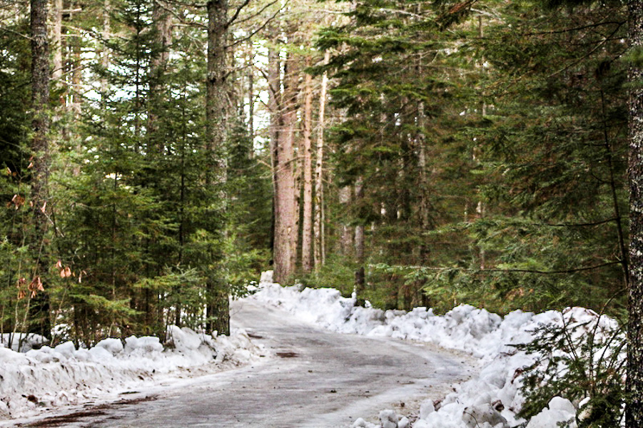
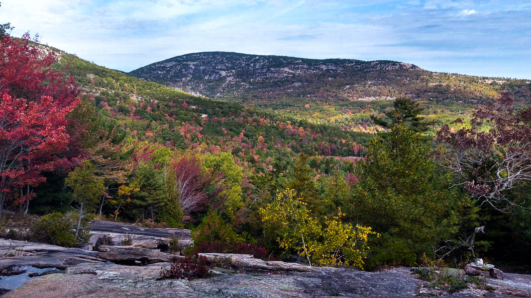
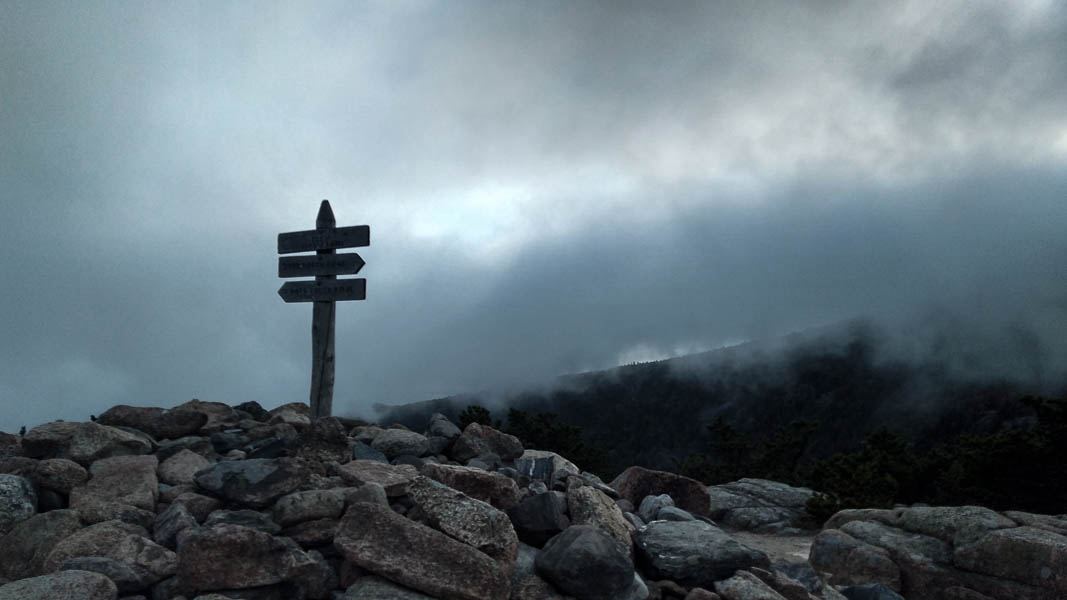
Acadia. This photo was pretty dark, so I played with the whites/blacks and exposure. However, the difference appeared more pronounced in Lightroom than in the uploaded version.
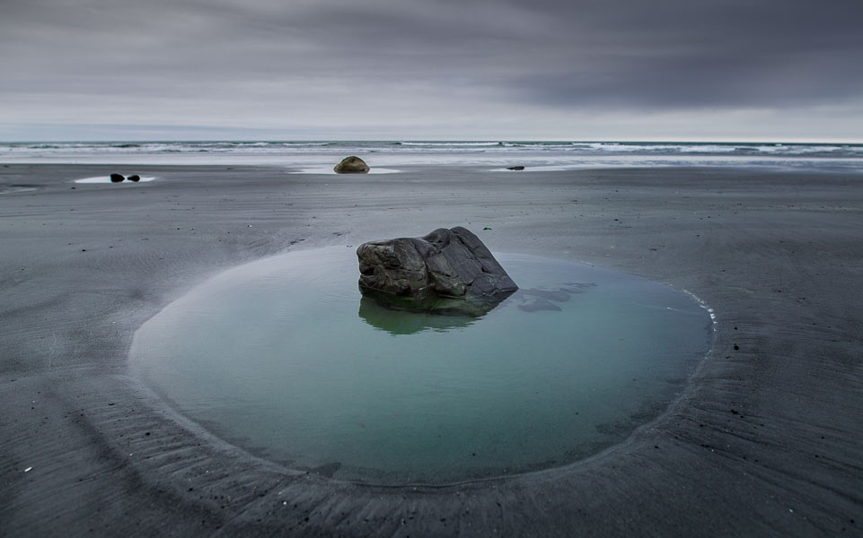
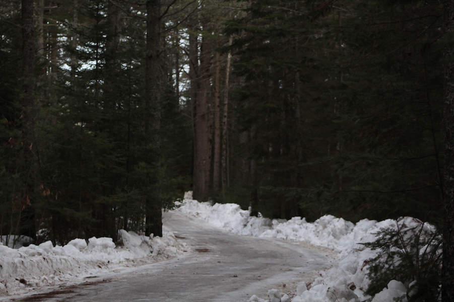
Acadia. I took more liberties with lighting and color to give the image a more mysterious mood.
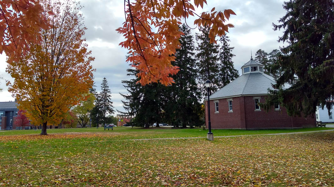

Cyrus Pavilion behind Fogler. The fall photos I take are never as vibrant as I would like, and this time I played with individual hues to adjust the color balance.
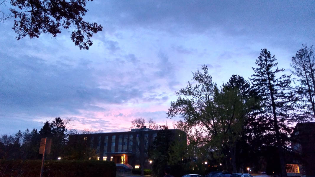
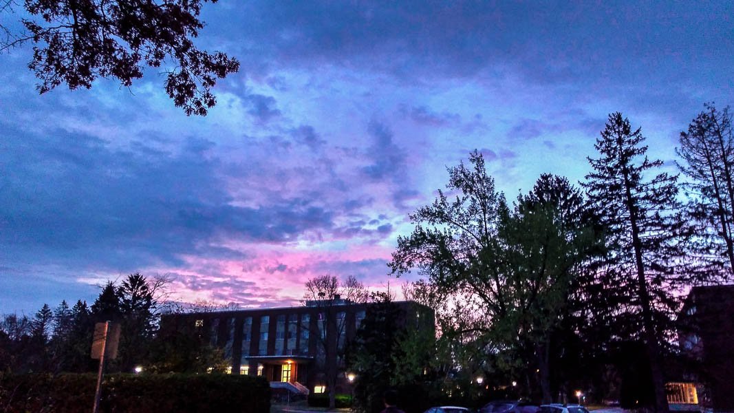
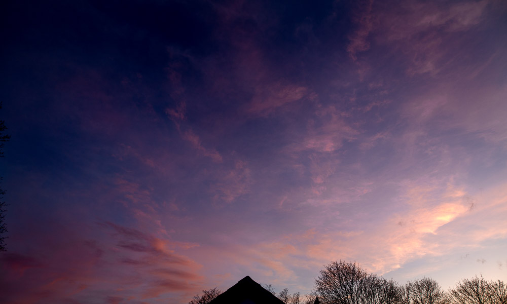
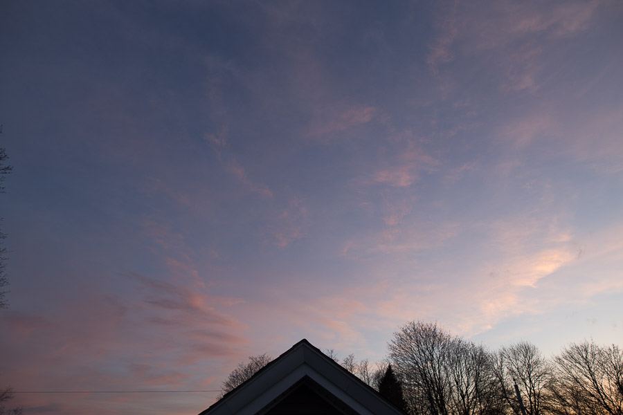
Sunrise over York Hall. Sunrise and sunset photos almost never come out with the proper color balance, so this was an attempt to remedy that.
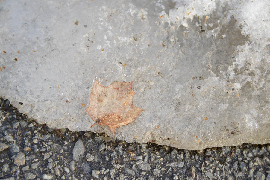
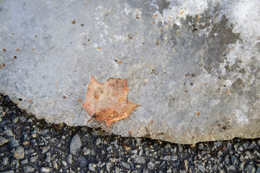
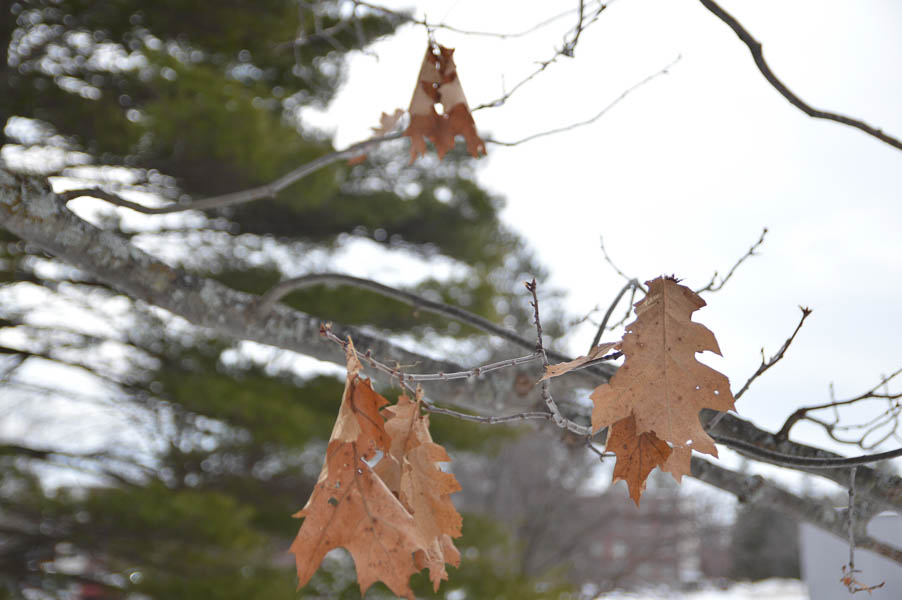
Leaf trapped in the ice from Assignment 1. I wanted to make this as crisp and striking as possible, which included increasing the vibrancy of the orange to make it stand out.
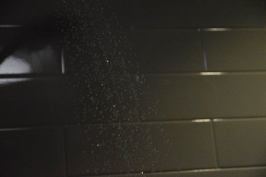
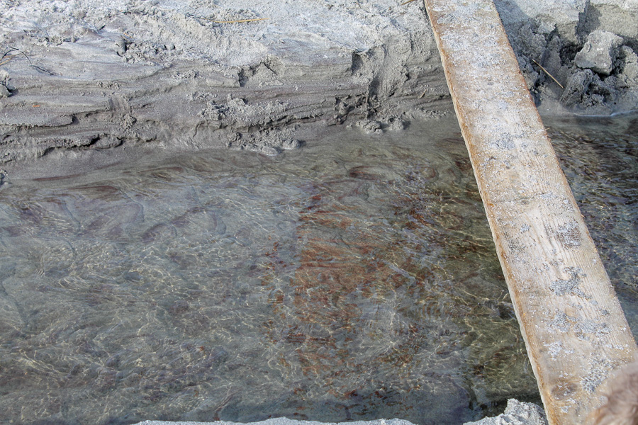
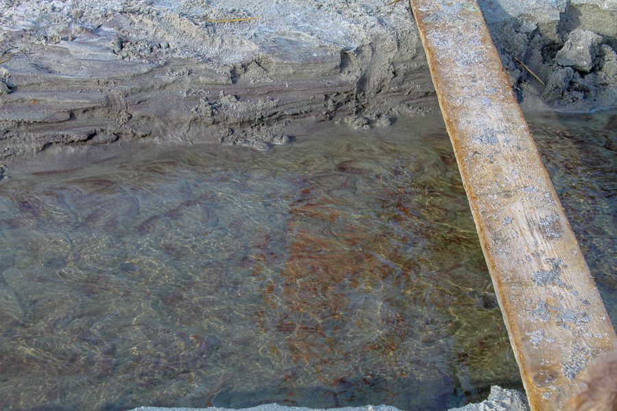
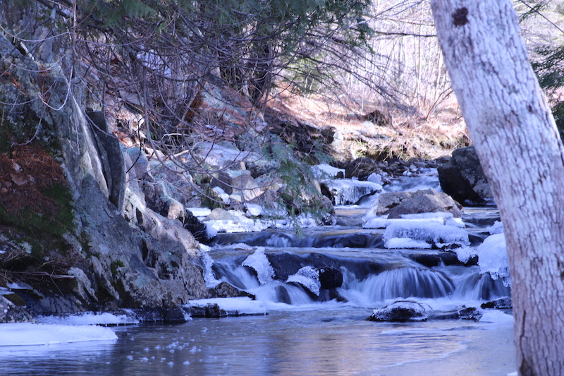
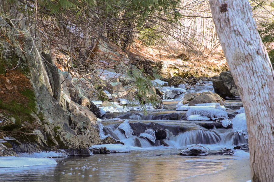
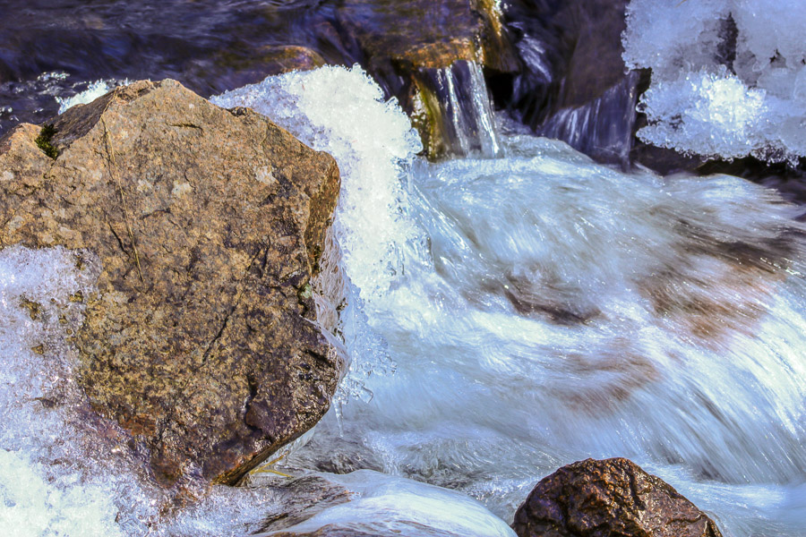
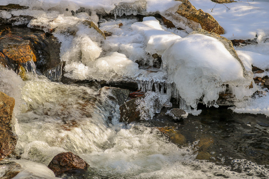
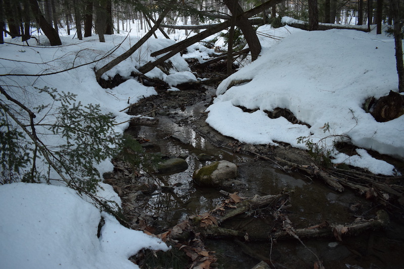
Flowing water from Assignment 4. The aperture setting did not let enough light in, so I increased the exposure considerably when editing to bring out more of the details. The image is still not as high quality as I would like because the lighting was not sufficient originally.
Leaves between Androscoggin and the rec center from class time on Feb. 15. Increasing contrast and other elements improved the photo somewhat, but even the post-production version still appears out of focus.
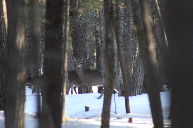
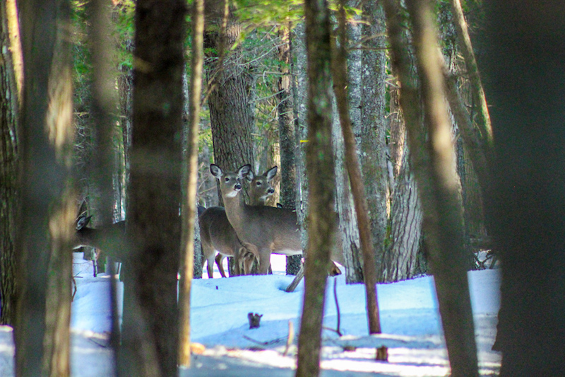
In this first photo, I thought it would be nice to try to bring out some of the colors. This was taken in winter when the trees and plants were still mostly dead, so I thought to increase the saturation and the luminance and vibrancy of the green in the photos would make it pop. I also wanted to lighten it a bit more, because the trees in the foreground gave the photo a dark kind of feel. Overall, I really like this photo because of the way the trees guide the viewer to the deer, who seem to be busy looking at something else.
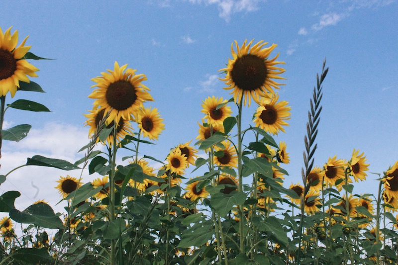
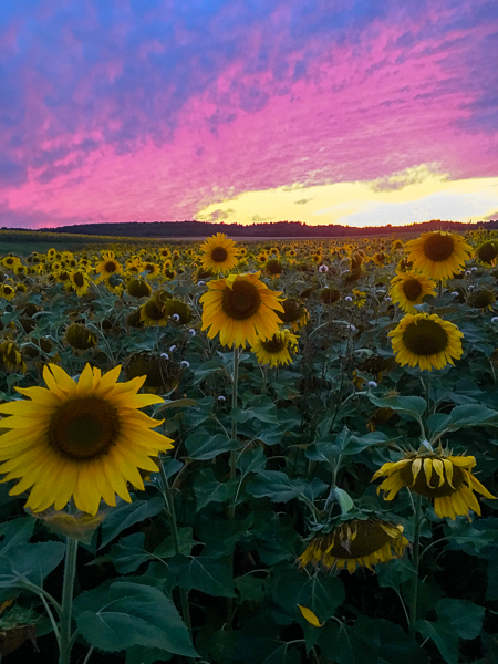
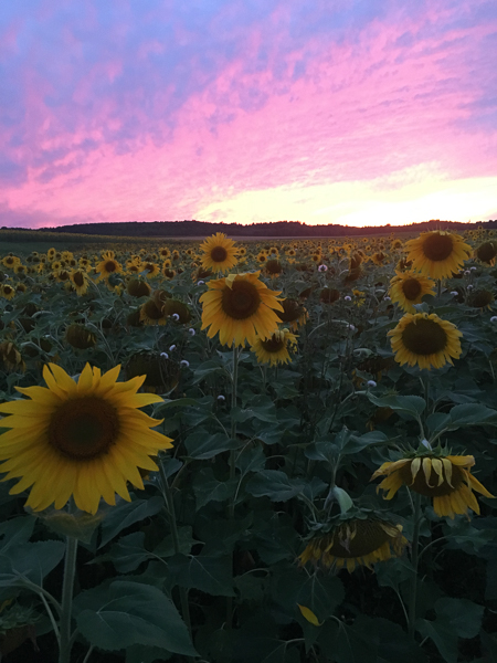
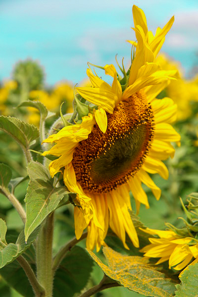
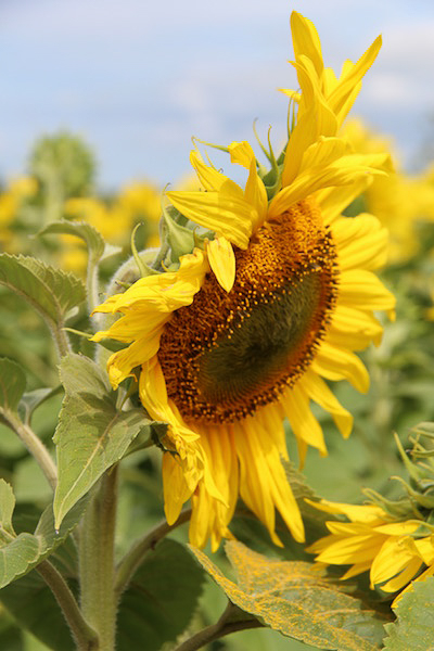
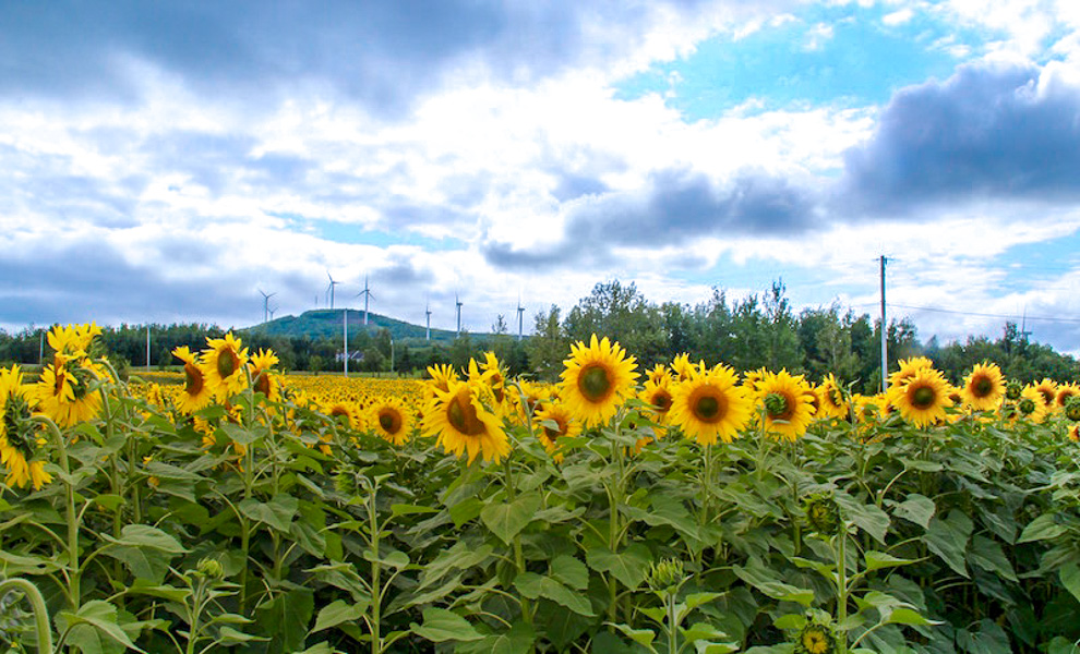
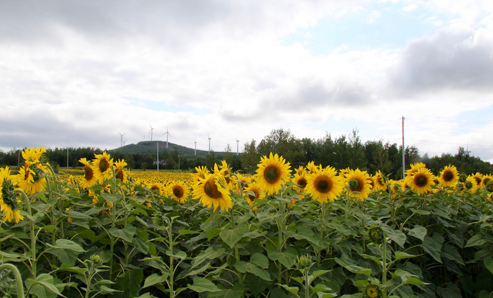
This second photo I took back at the end of the summer before the first semester. I wanted to edit it because it is one of my favorite photos, as sunflowers are my favorite flower. In the original, I thought the colors were kind of washed out because it was a relatively bright day. Because of this, I decided to darken and saturate the colors of the photos to really make them pop and contrast with one another.
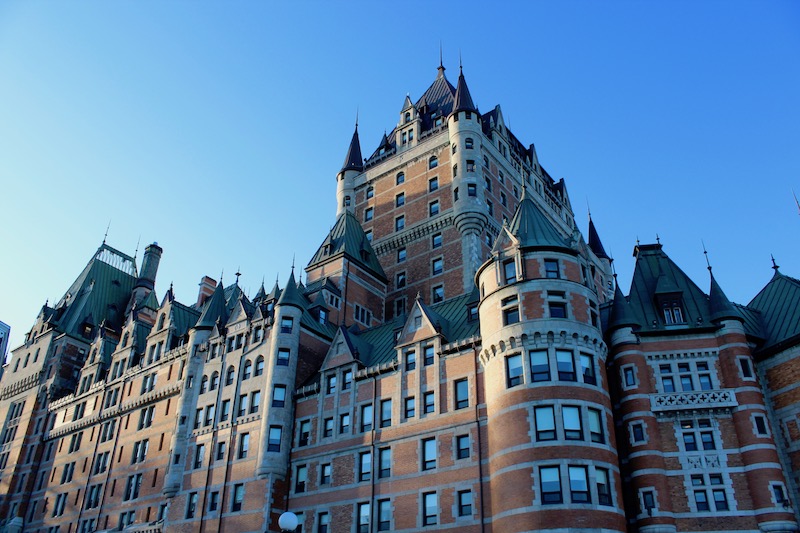
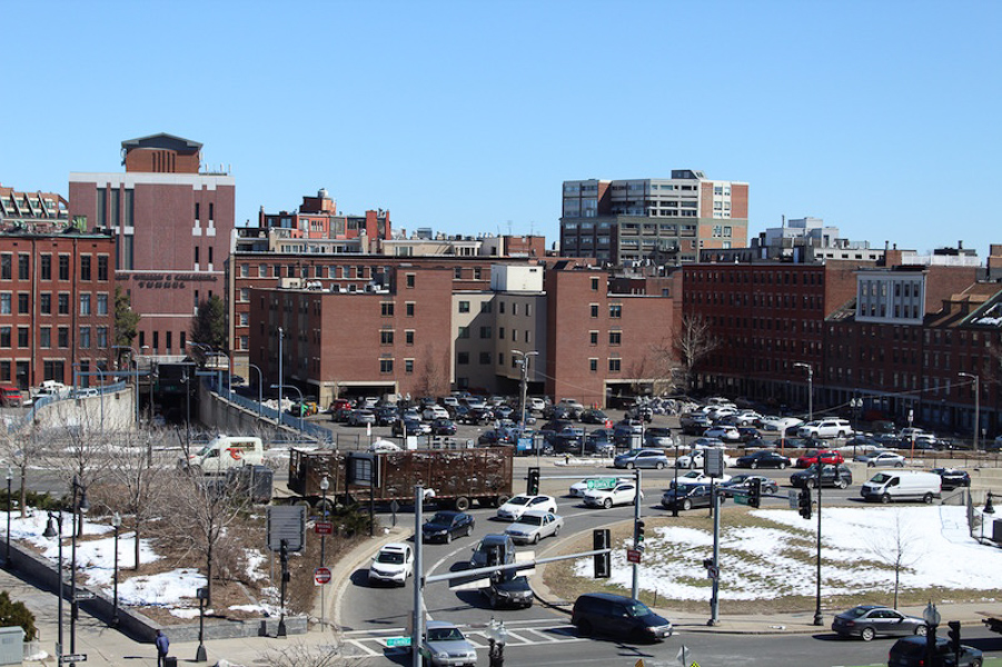
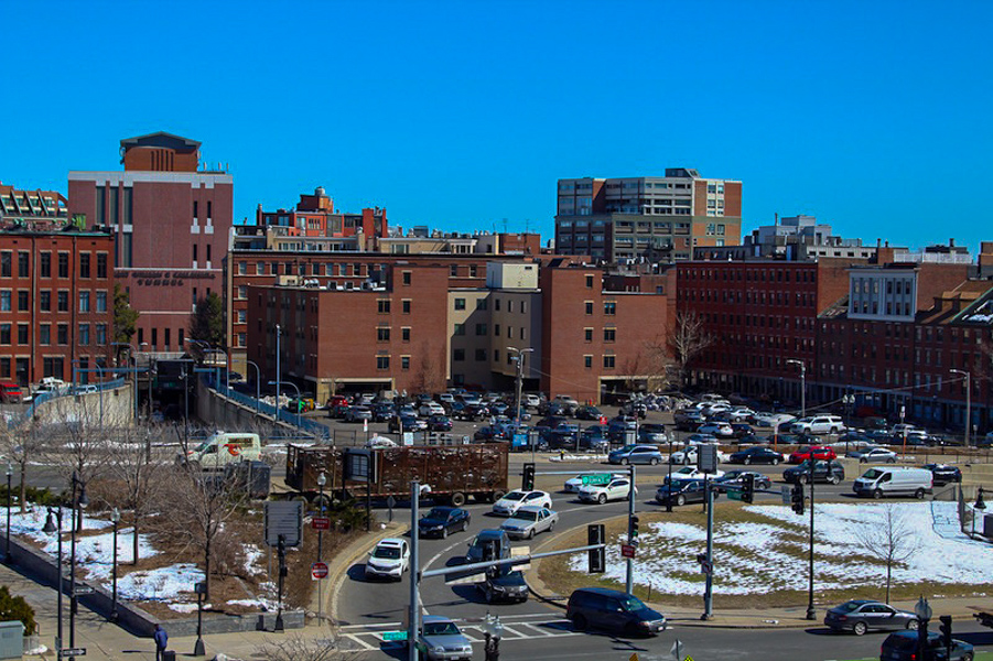
When playing with editing this one, I noticed that you can alter just specific colors of photos. I was playing with how the orange and the red of the building looked, and discovered that by increasing the luminosity of the orange, I was able to alter the photo to make it look like it was taken almost at sunset, with golden sunlight hitting it, instead of the middle of the afternoon where the bricks were mostly washed out. I also liked how this upped the contrast of the blue reflection of the sky in all the windows, because to me it made them stand out more.
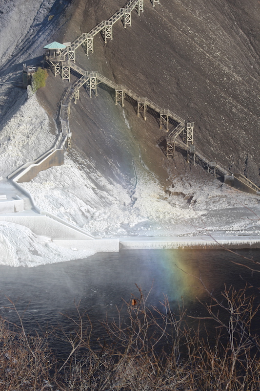
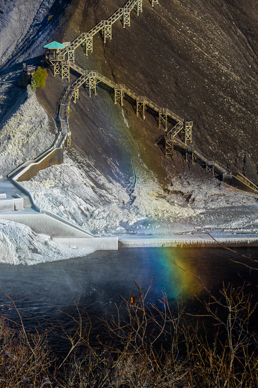
I took this photo in Quebec, at Montmorency Falls. The mist from the waterfall, not pictured here, was being struck by the light of the sun and was creating a rainbow as the light refracted through the water. I really wanted to bring the colors of the rainbow out and make it the focal of the picture. However, I noticed that there were a lot of details in this photo behind the rainbow as well, in the ice and stairs of the walkway on the hill behind it. I increased the blacks and contrast in this photo to really set some heavy dark lines and accentuate how detailed the photo is.
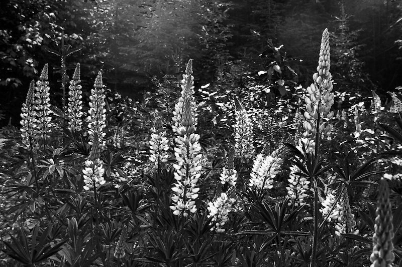
This edit happened by accident. I was playing around with the saturation like I was doing for the sunflower picture, and I decided to go over and look at some of the presets that Lightroom already has. I was looking at the vintage ones when I accidentally clicked on black and white. I immediately was drawn to how the image seemed to invert, and how even though the colors were gone, you could still distinguish between all the flowers and the grass. I also really liked how once I made the photo darker, it seemed to change the feel of the photo to something darker and more ominous, like the remnants of a beautiful flower field.
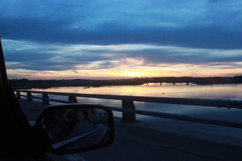
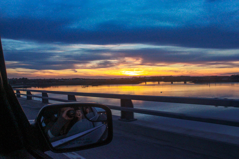
Sunset photos are my favorite to take and work with. I am always drawn to trying to make them look as beautiful as they are to the human eye, and in order to do that with this photo, I had to increase the exposure and saturation to bring out all the colors. I also liked how then you could see me in the mirror of the car taking the picture because it was nice to see how I placed in the setting and highlights how this picture was taken in a moving car.
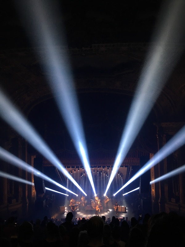
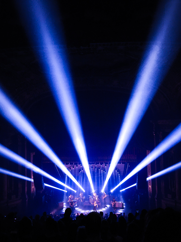
This was a favorite photo of the ones I took at a Paramore concert in Boston. I captured this photo by accident because I was just pointing and shooting with my phone. I really loved how the lights drew lines outward from the center where the band was for your eyes to follow.I thought that the colors in the photo were kind of dull, and this did not capture the energy, excitement, and overall feel of how Paramore is at a show. So, I decided to change the temperature of the photo to increase the blues in the photo, making the photo pop even more.
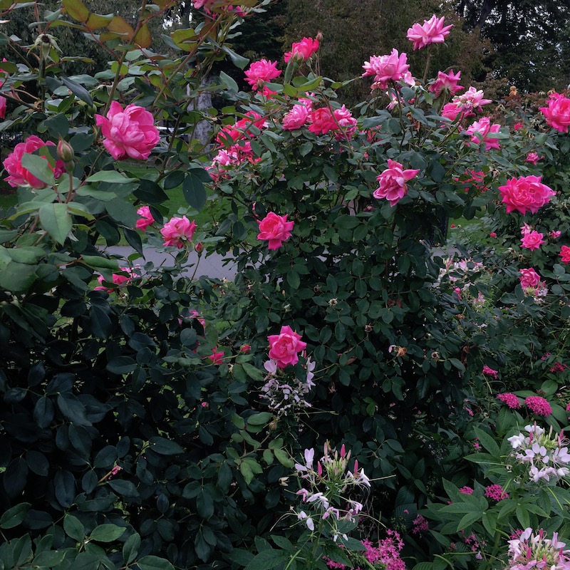

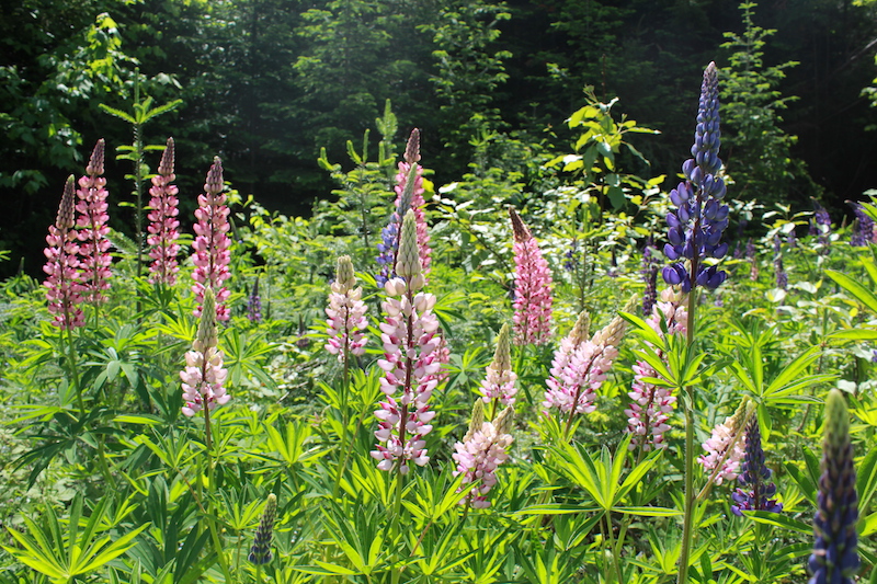
I really liked brightly colored images. By the time I was editing this photo I realized that increasing the saturation so that colors really pop out is a style that I really enjoy using. I liked how even in the background, in between the branches, you can see that the dark shadows and the path behind the bush all seem green as well, and it makes the photo seem wilder and full of life than before when it was duller.
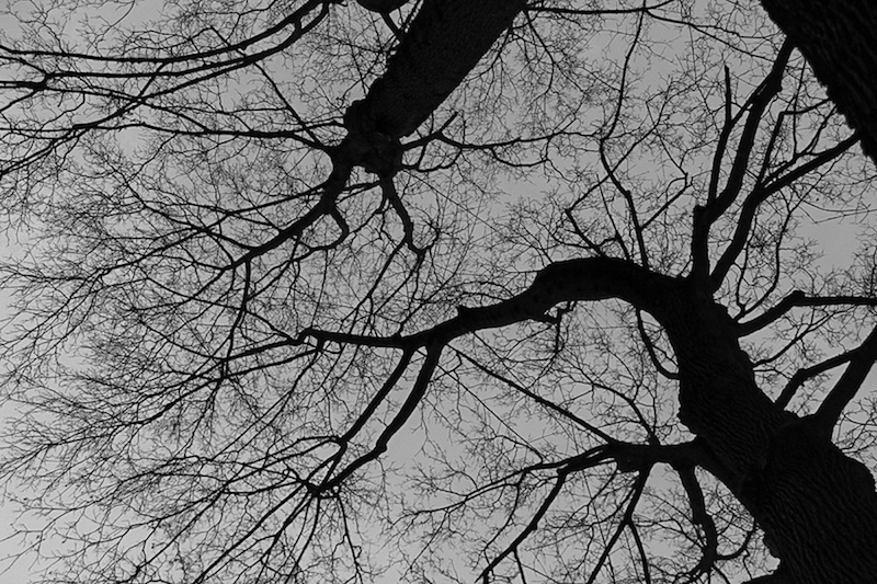
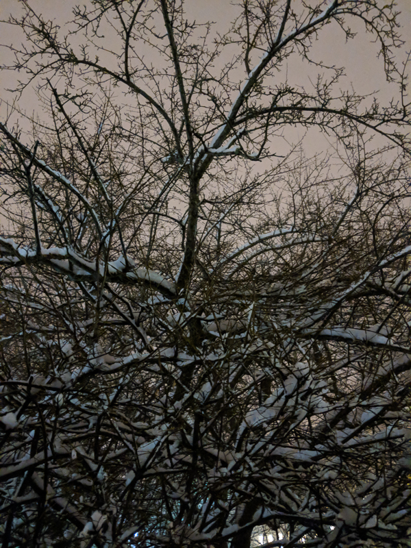
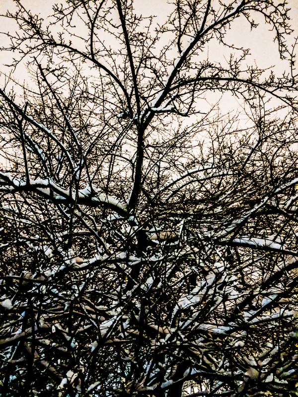
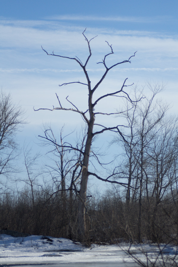
After using a black and white filter for the flower images, I realized that this photo would be pretty cool to try black and white. I really like how the branches cut across the sky as a shadow, so that you are looking at the negative space between them and it’s not a conventional way to look at a tree. I wanted to change it from color to black and white so there could be more focus on the pattern and the lines of the picture than the color of the sky behind it.
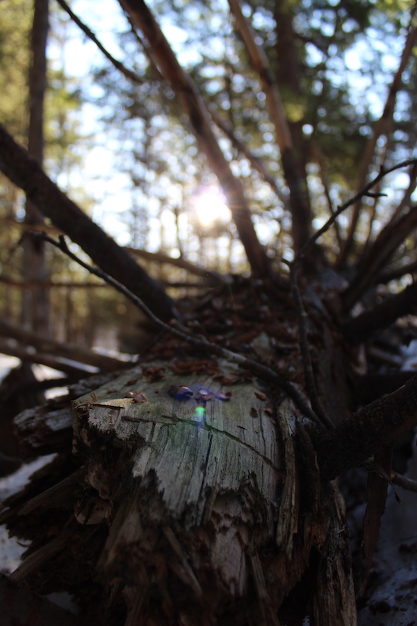
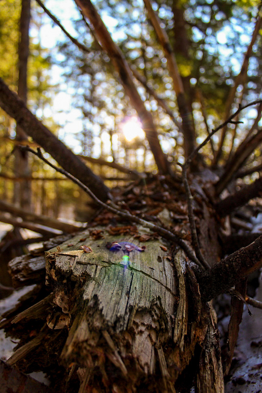
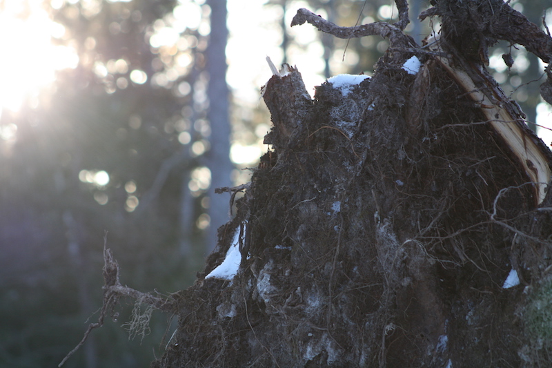
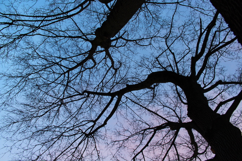
I really like this picture, and when I took it, it was the first sunny day we had seen in a while. I was walking through the woods and felt at peace, warm with sunlight. I wanted to capture that here in this image, with the sun rays coming through the branches, and the branches answering with their own reaching out from the central log. In order to portray this idea more clearly, I upped the temperature of this photo to make it warmer. I also really liked the sun flare that I captured on the log because it adds a pop of color that you know is from just the sunlight, so it’s capturing something usually unseen.
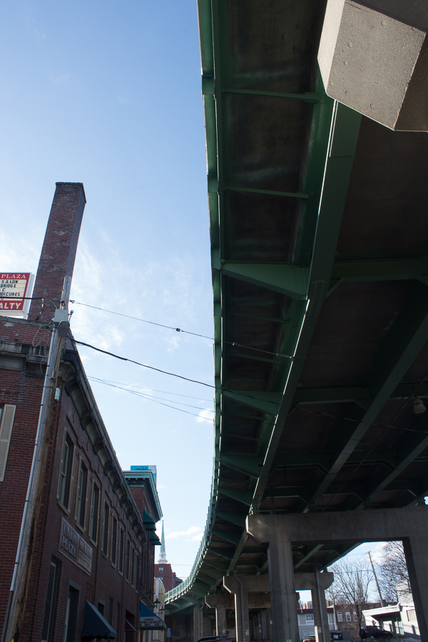
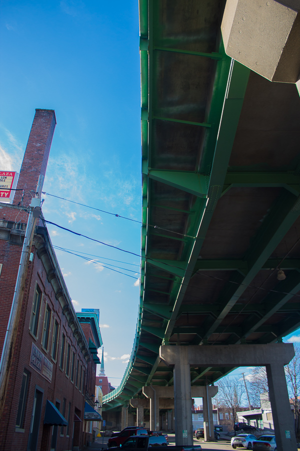
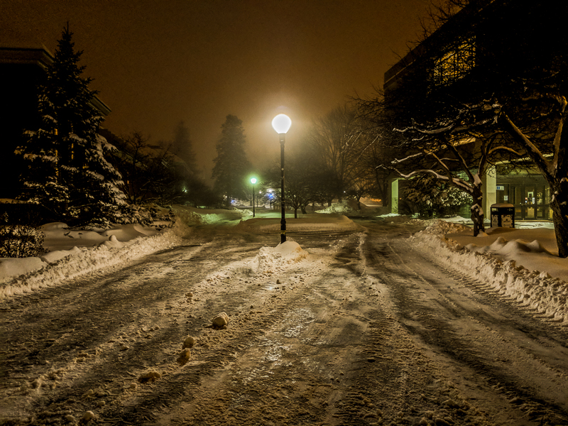
I was drawn to this bridge while walking under it in downtown Bangor. I really like trying to find leading lines in everyday settings, and I found that the way this bridge curved in contrast with the straight line of the building and the connecting lines of the wires were very interesting. This photo was relatively dark when I started, so I decided to increase the exposure to bring out some of the light underneath the bridge and get rid of the shadow. I also wanted to bring up the color, because colorful photos are prettier to me.
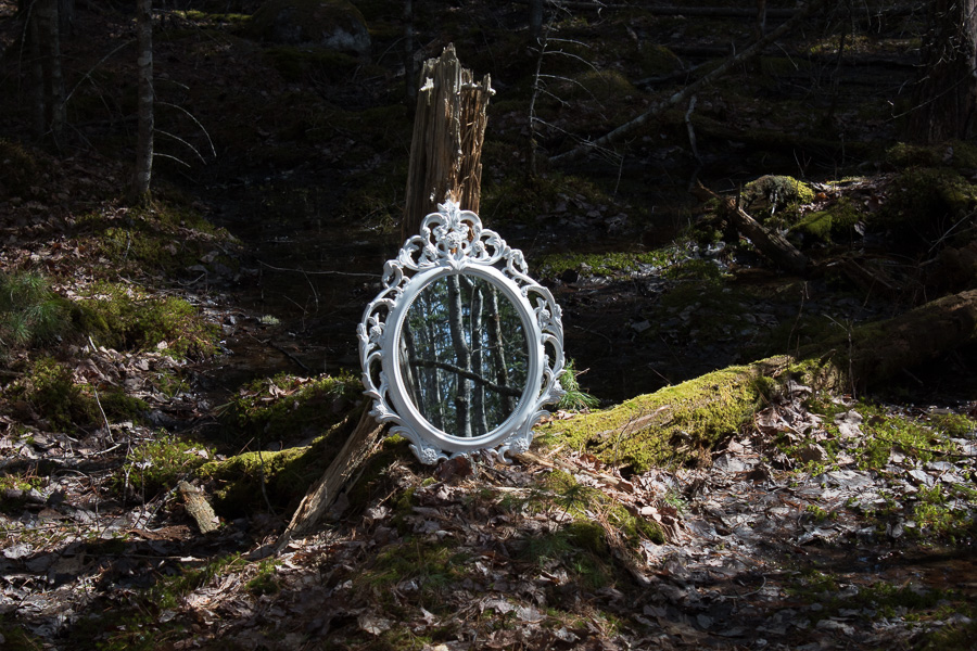

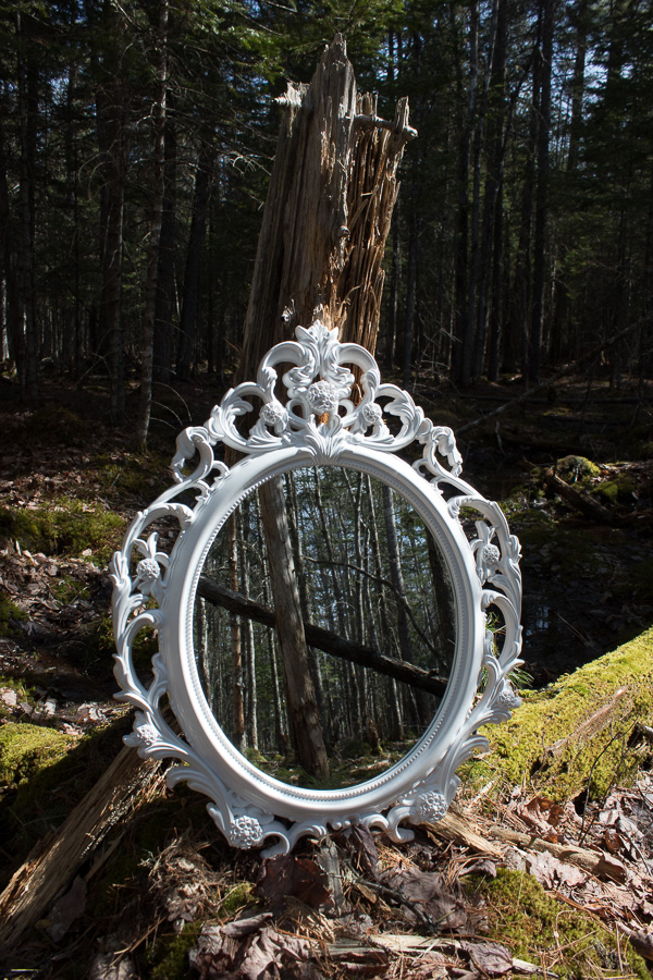
This is one of the photos I used for my final. The original picture has a very dark background, that is hidden in shadow, and the colors are washed out because of the bright sun. I increased the exposure and lowered the shadows so that we could see more of the texture and detail of the forest behind the mirror. I also made the image warmer, because it seemed more inviting and nicer to look at, and really brought out the colors.
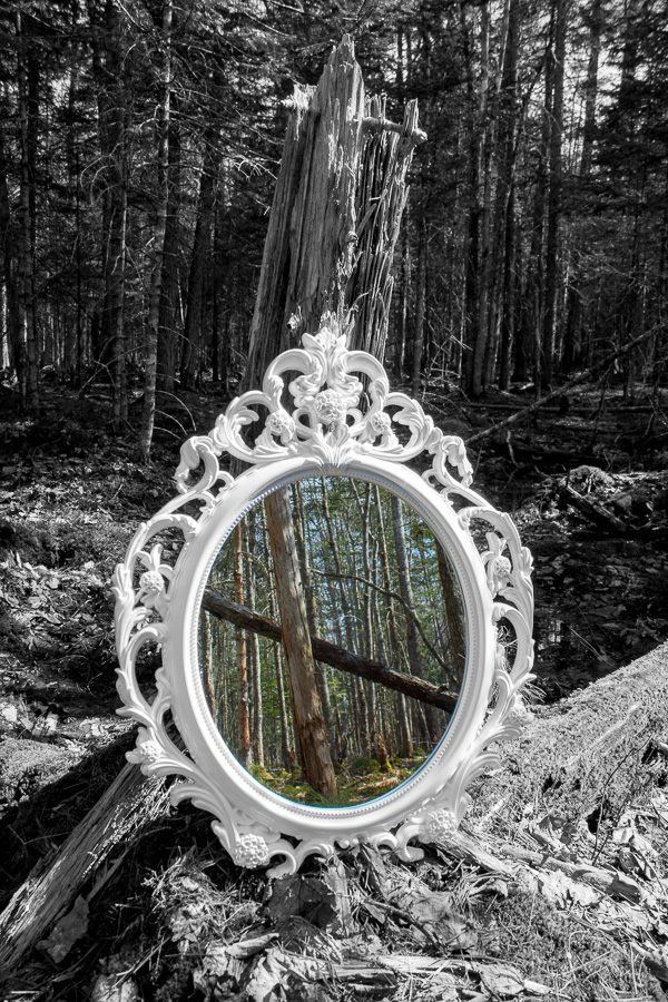
This photo was really fun to edit, because it was the one that made me discover where I wanted to go with the photo narrative. While trying to use a focal circle to just increase the exposure of the mirror, I realized that in that circle I could decrease the saturation enough so that it was in black and white. I then inverted the circle, so that all the edits were outside and the original color was on the inside of the mirror. I thought this was so intruiging because it looks like a portal to a different, more colorful world, and highlights the idea that the mirror can show us things we don’t normally see. I also increased the saturation of the color in the mirror, to make it stand out against the black and white even more.
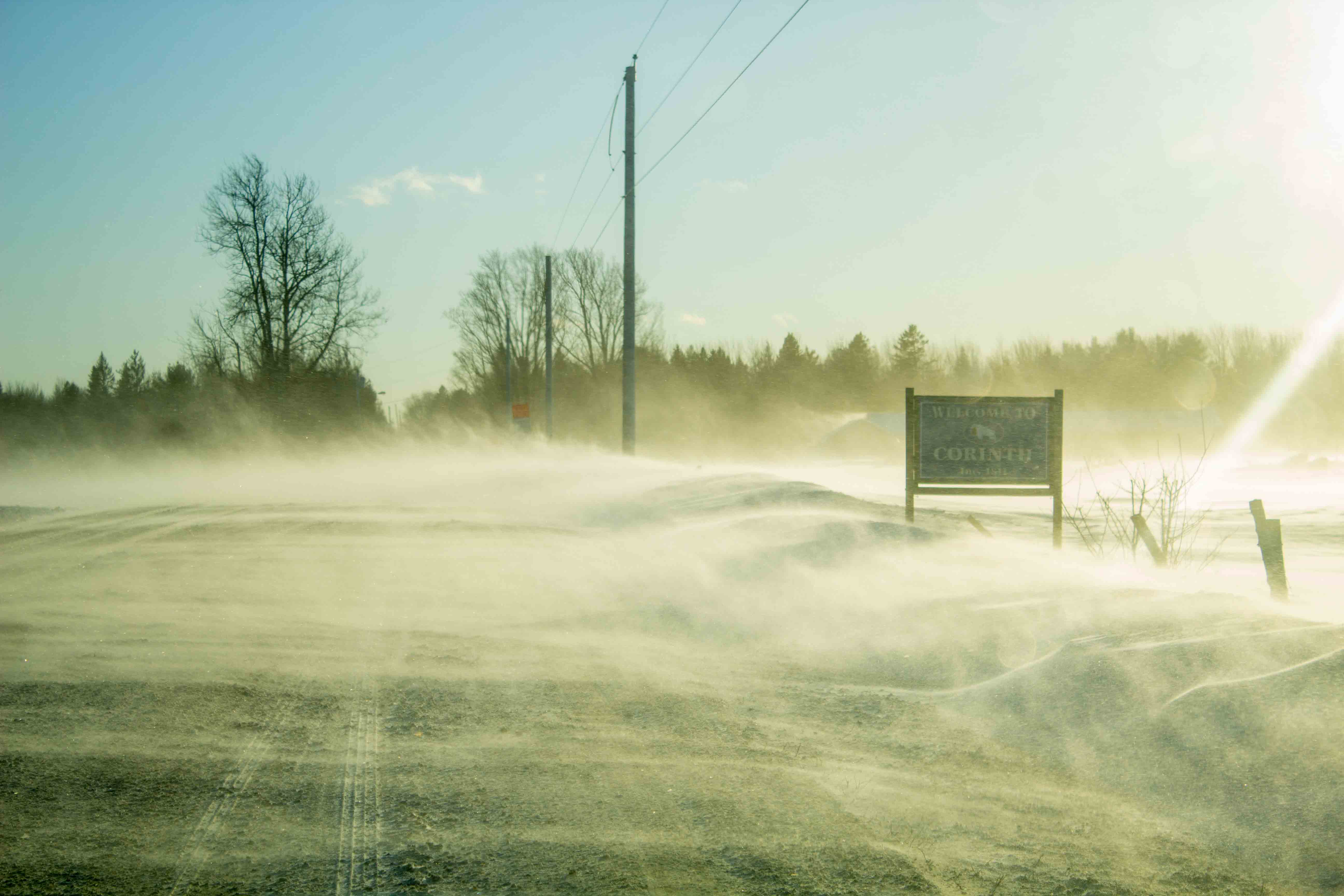
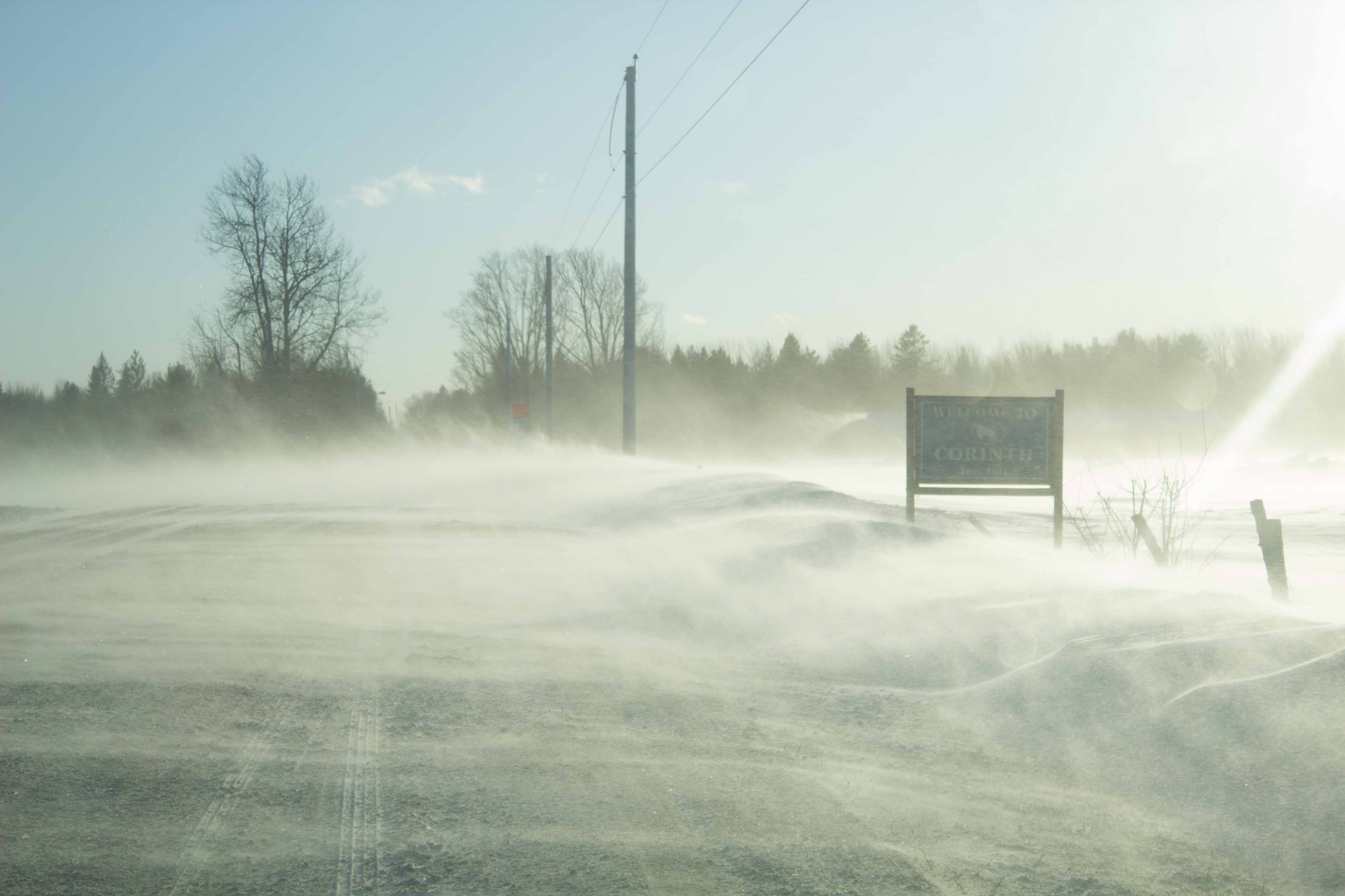
This picture was taken on the Hudson and Corinth town line. I thought it would be interesting to increase the yellow hues and make the image look a little weathered.
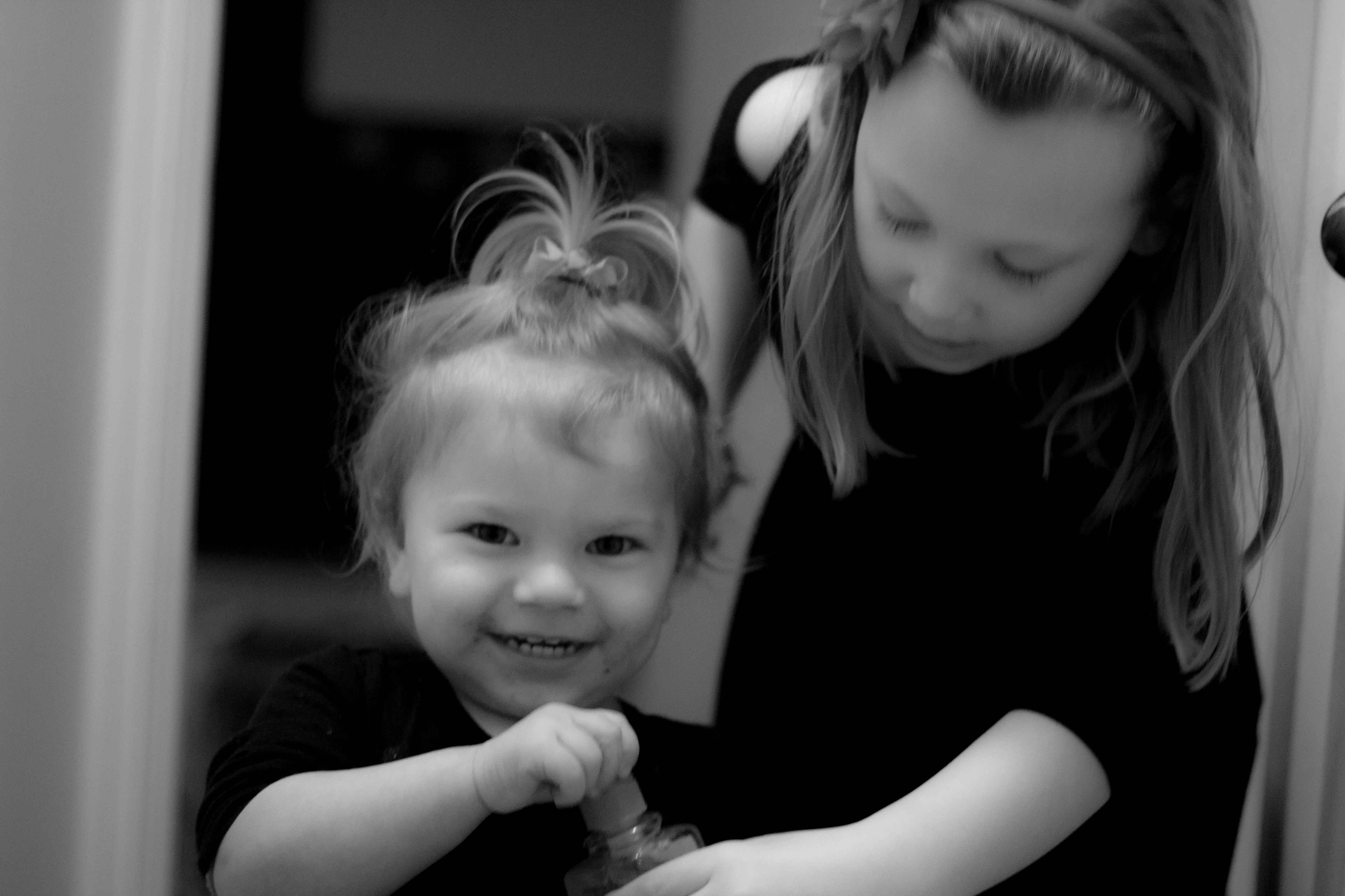
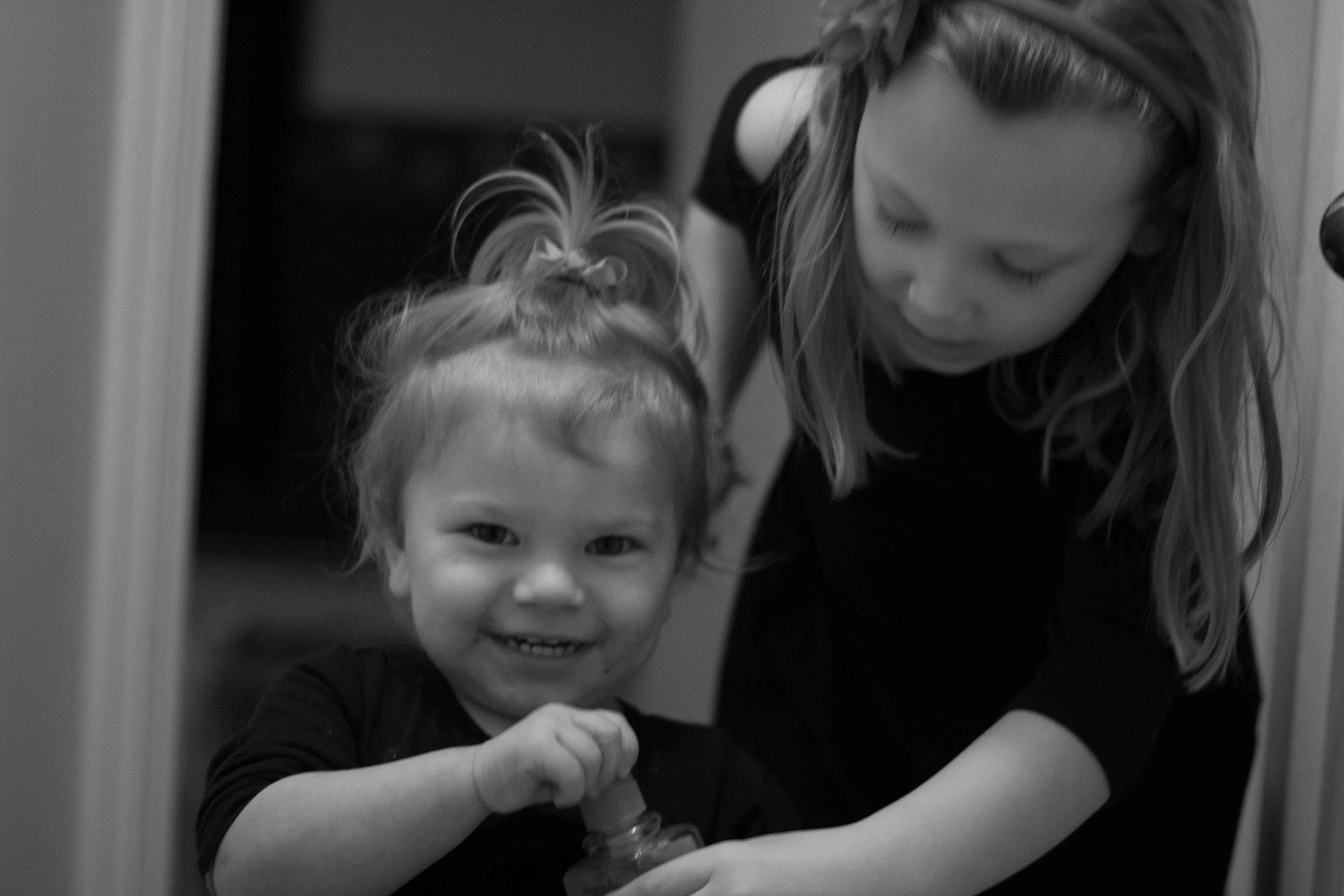
This picture was taken at Christmas. It features my cousin Riley and my other cousins daughter. I thought making the picture black and white would give it a timeless appeal. I increased the blacks in the picture and softened the clarity to make it look more like a portrait.
This photo was taken with a 300 mm lens. It is kind of shaky but I wanted to see what colors I could get out of the sky so I increased the color saturations. I used a graduated filter to increase exposure on the bottom of the photo.
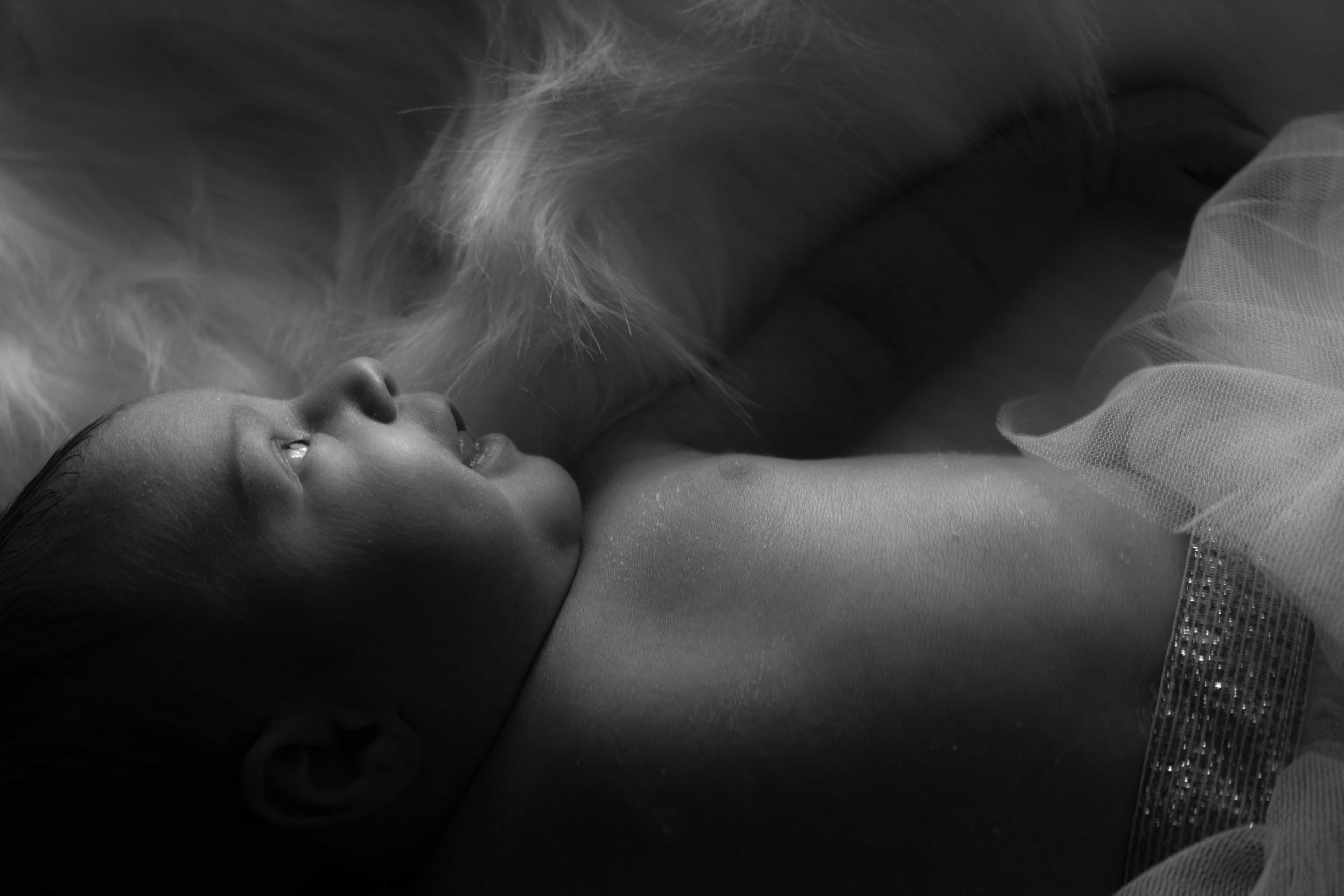
This is one of the new born pictures of my baby niece. I caught her smile just perfectly while looking at the light through the window, probably just gas. I like the way the light looks in black and white. I increased the shadows and darks in the photo and increased the exposure. I decreased the clarity to give her skin a soft look.
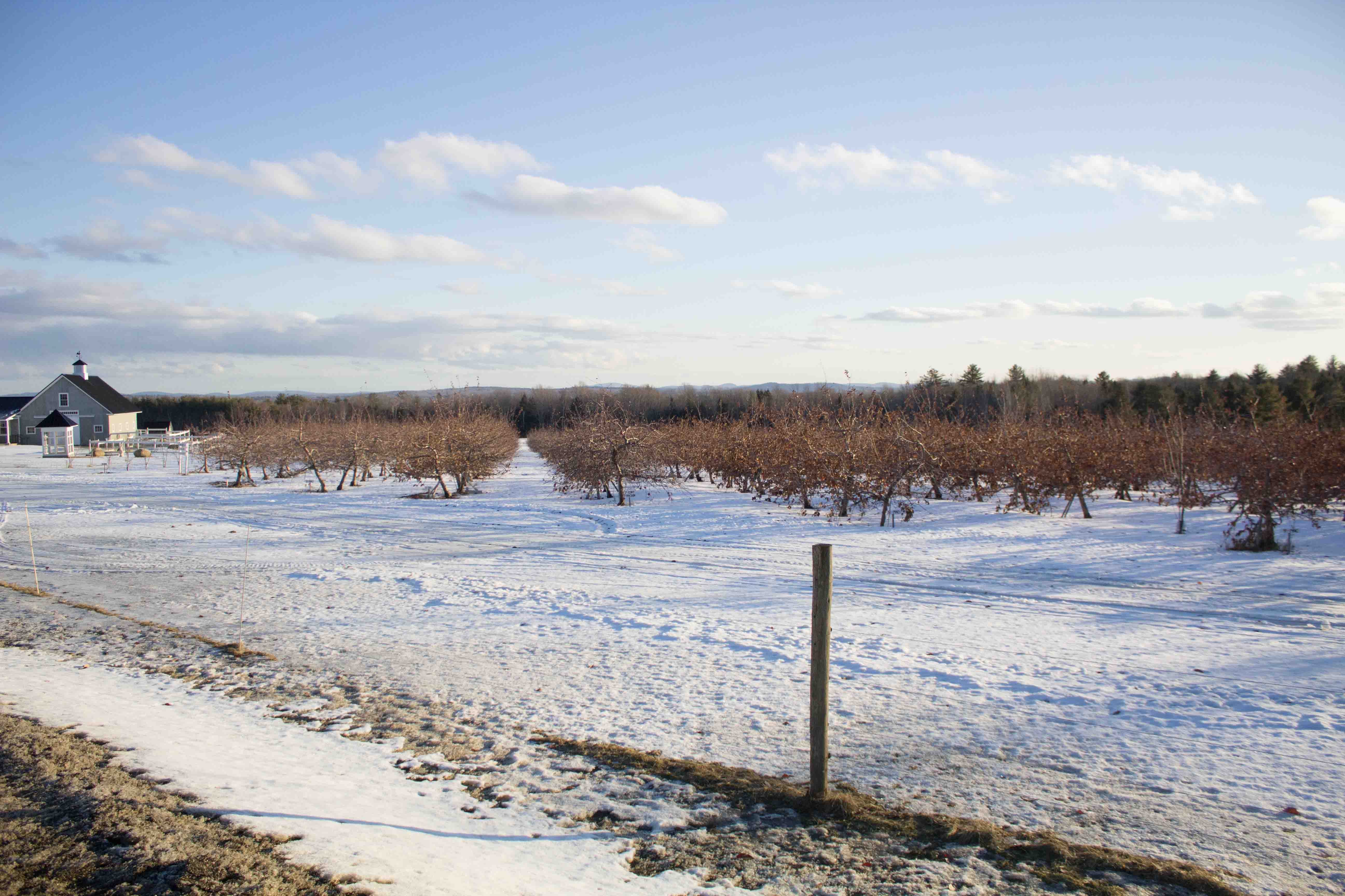
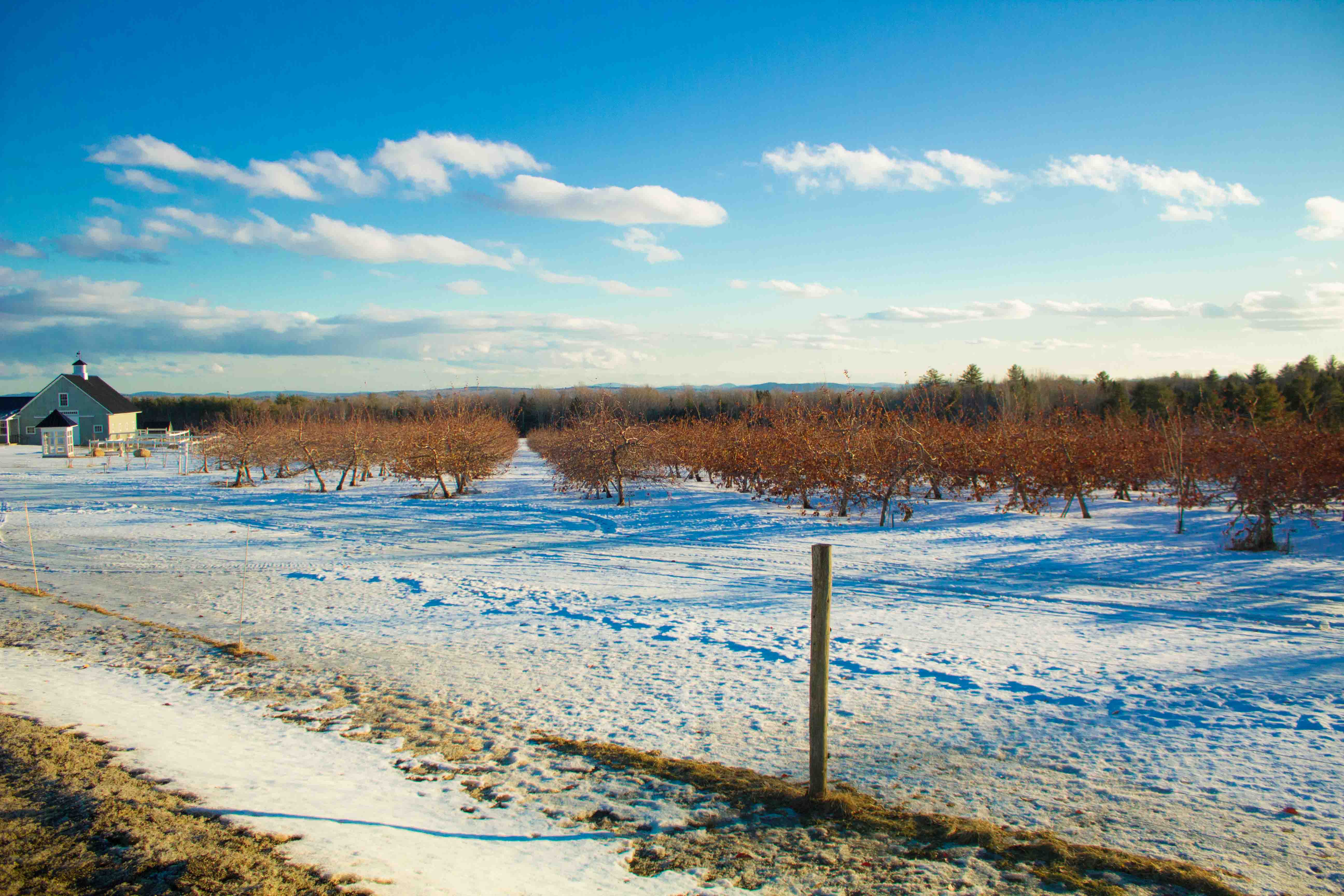
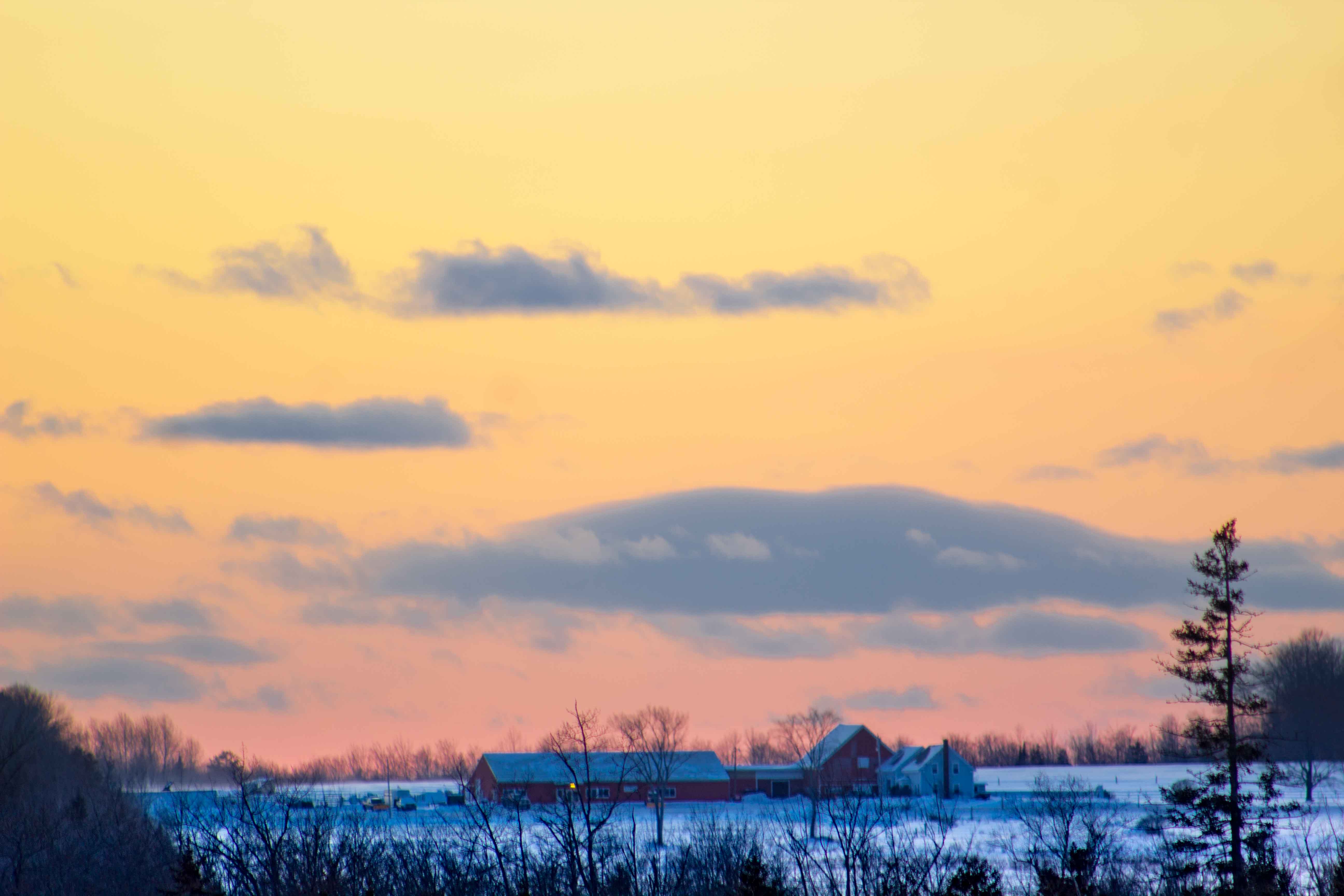
This photo was taken of the apple trees at the Treworgy’s farm in Levant. I wanted to capture the colors of the sky with the colors of the trees. I increased the color saturation in the reds, yellows and blues.
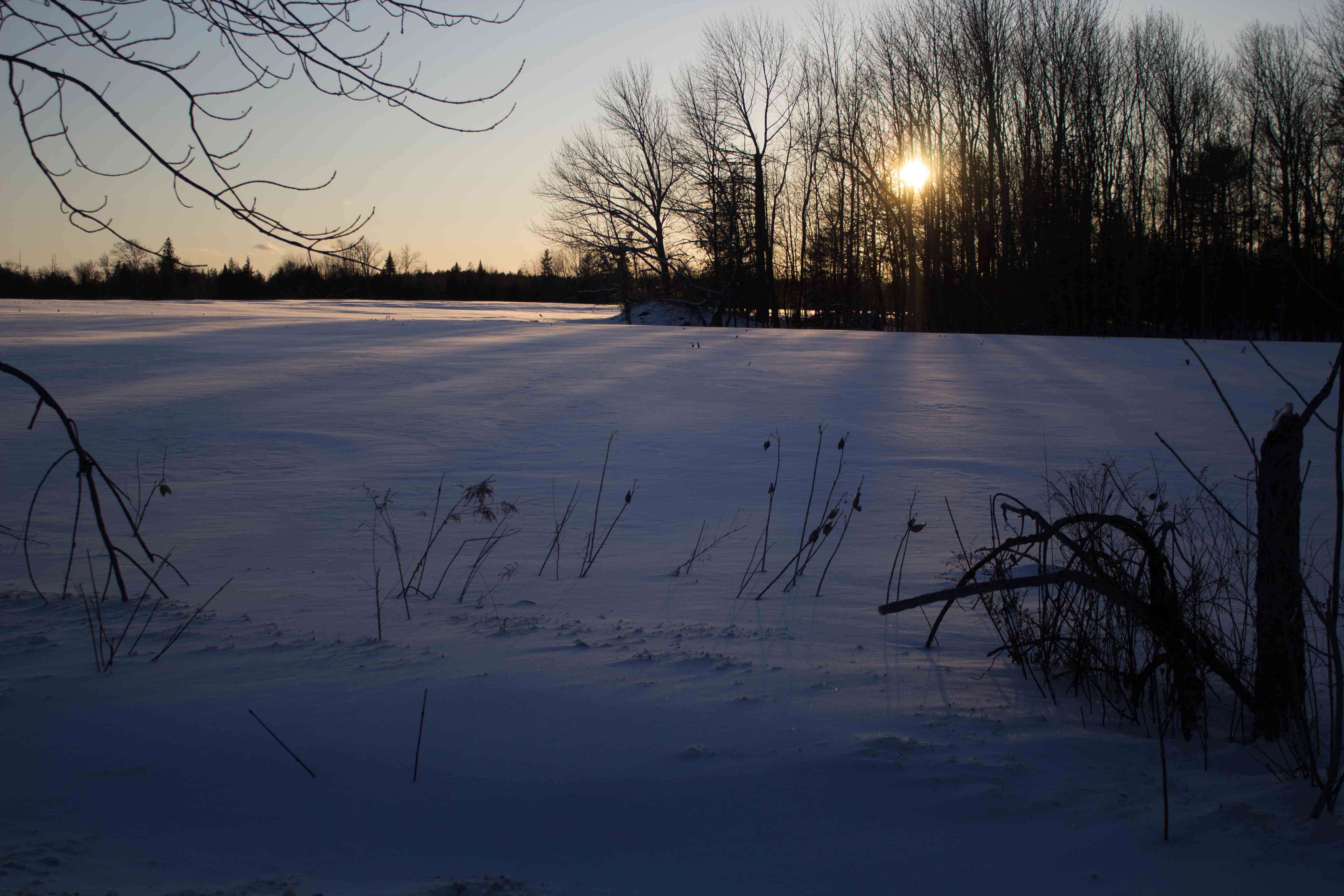
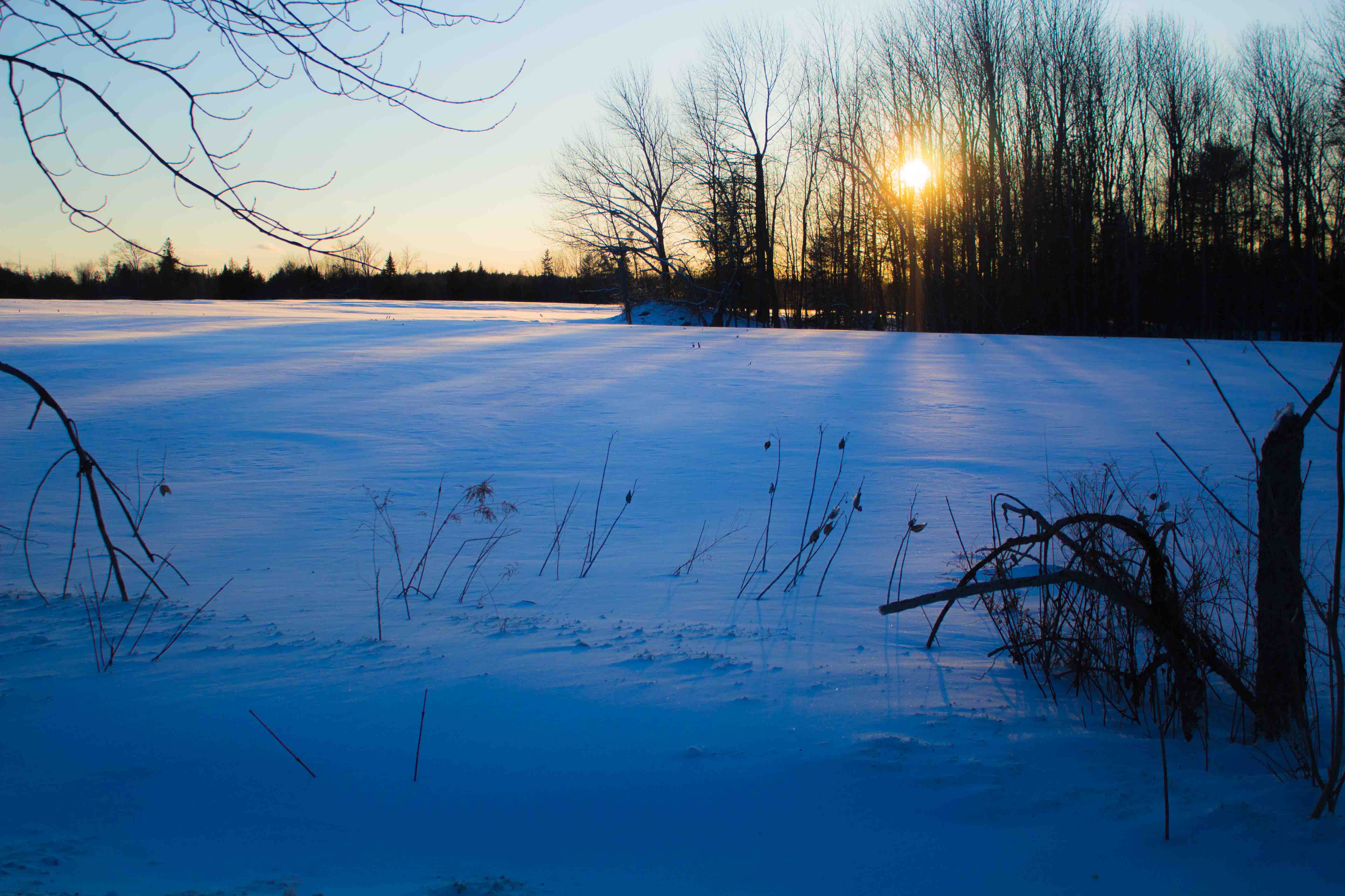
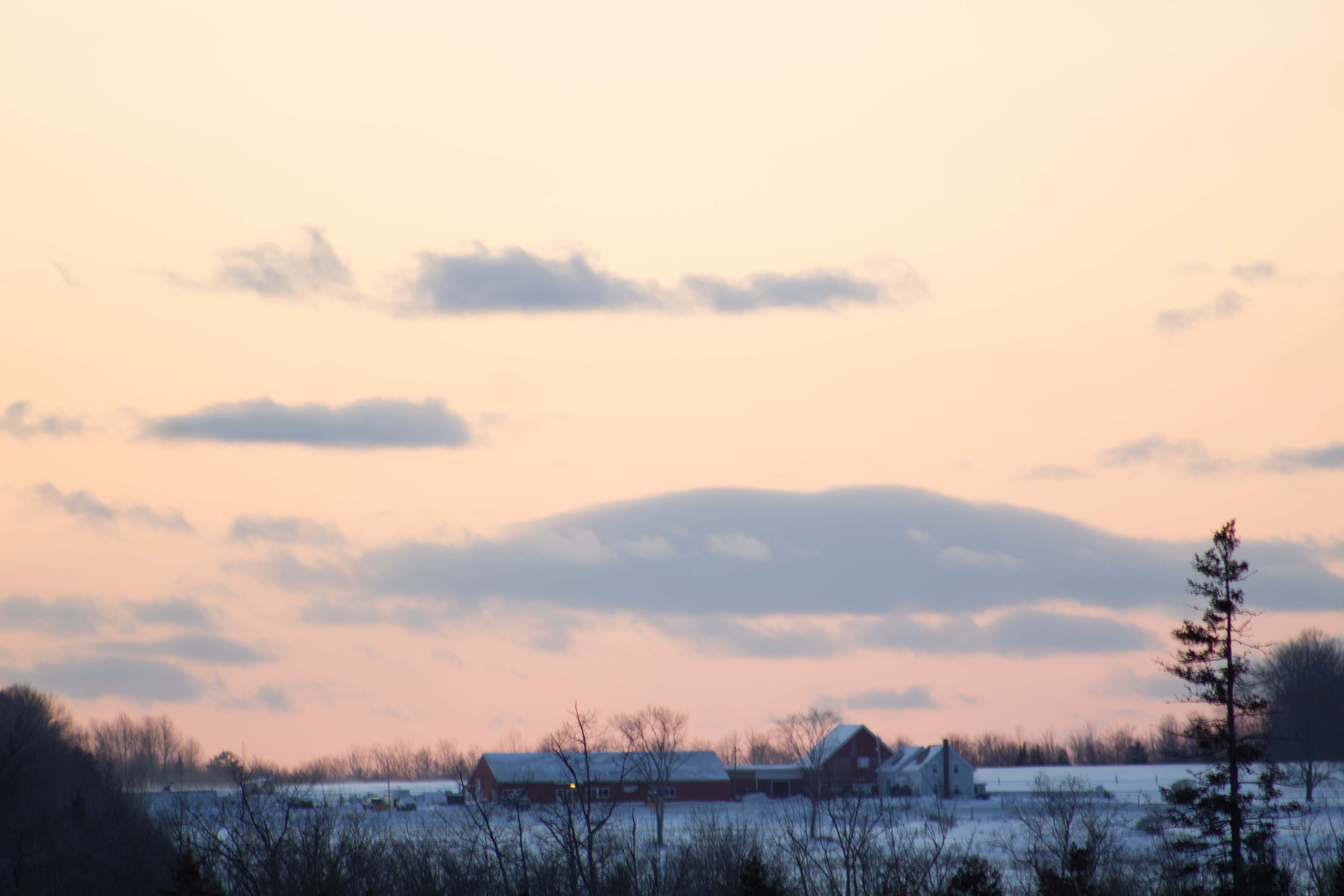
This picture was taken in a field in Corinth. I liked the way the sun was setting through the trees. I really wanted to see what kinds of yellows and blues I could get out of this photo so I increased the hue in each. I also increased the shadows to make the trees look more like a silhouette.
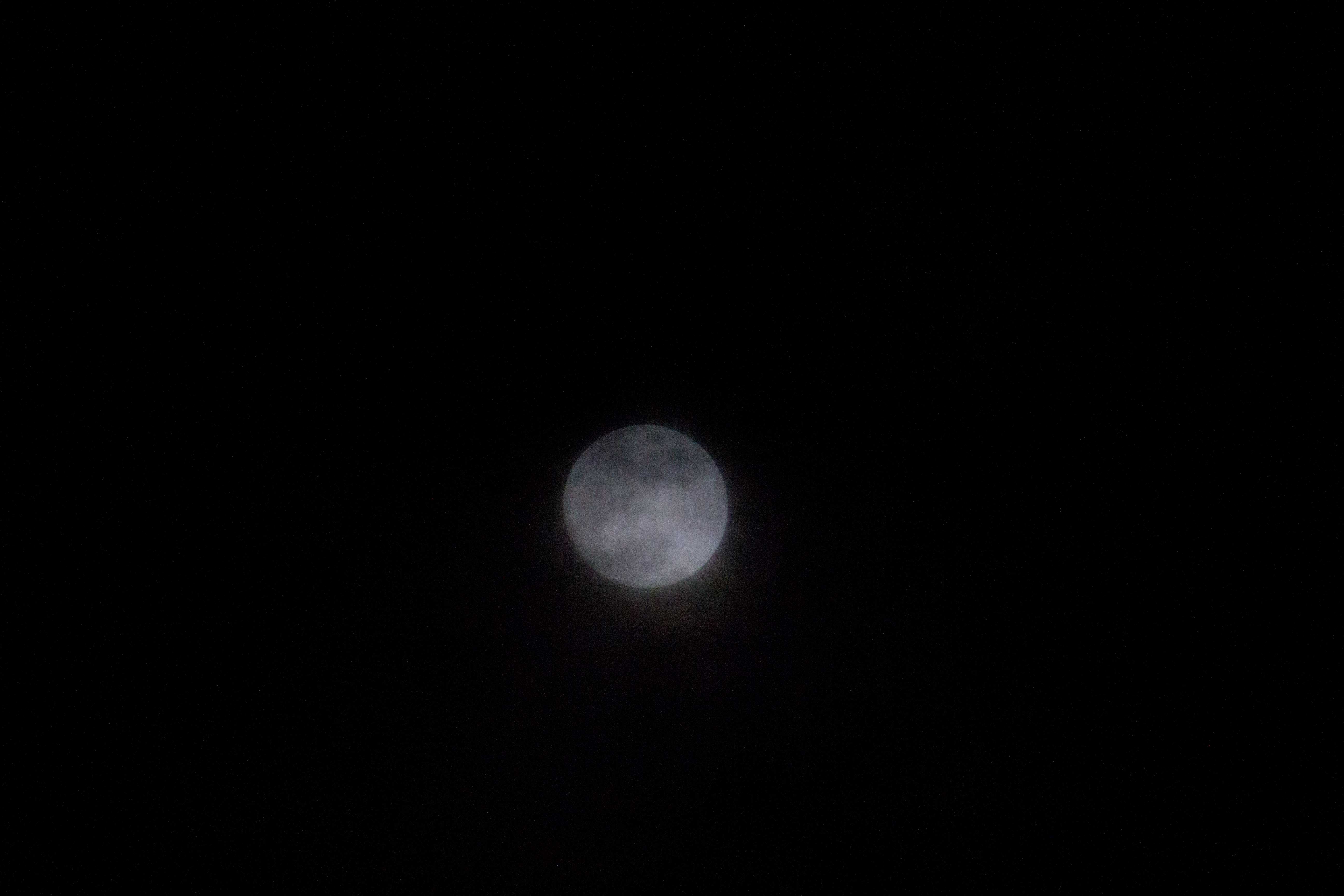
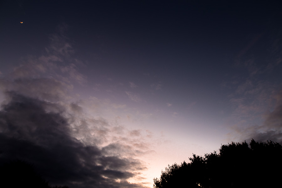
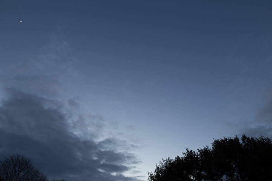
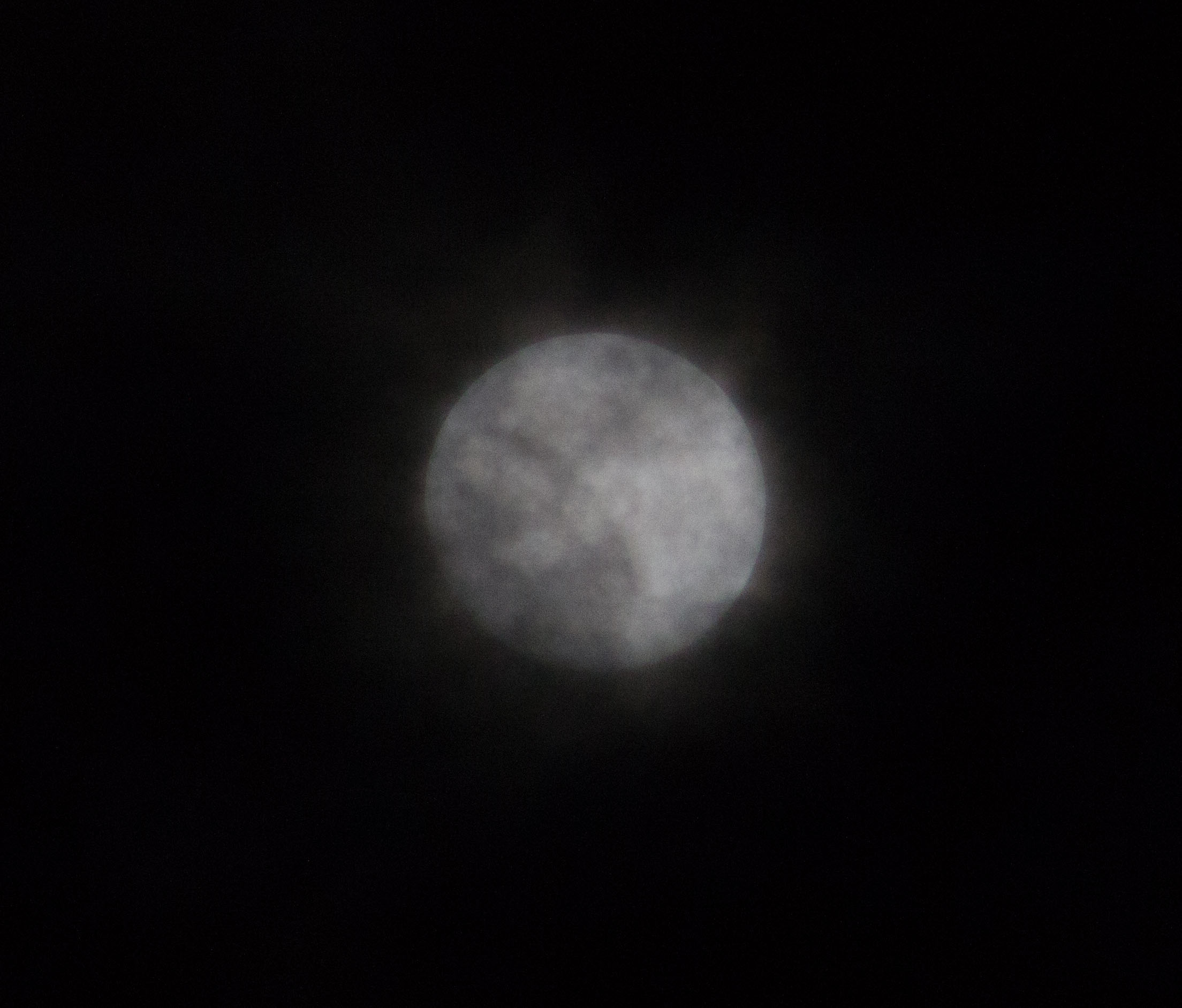
I tried taking a picture of the moon at 300 mm but I didn’t get the clarity I wanted. I tried increasing the clarity, whites and shadows. There wasn’t much color in this photo to work with so I focused on trying to get the right light.
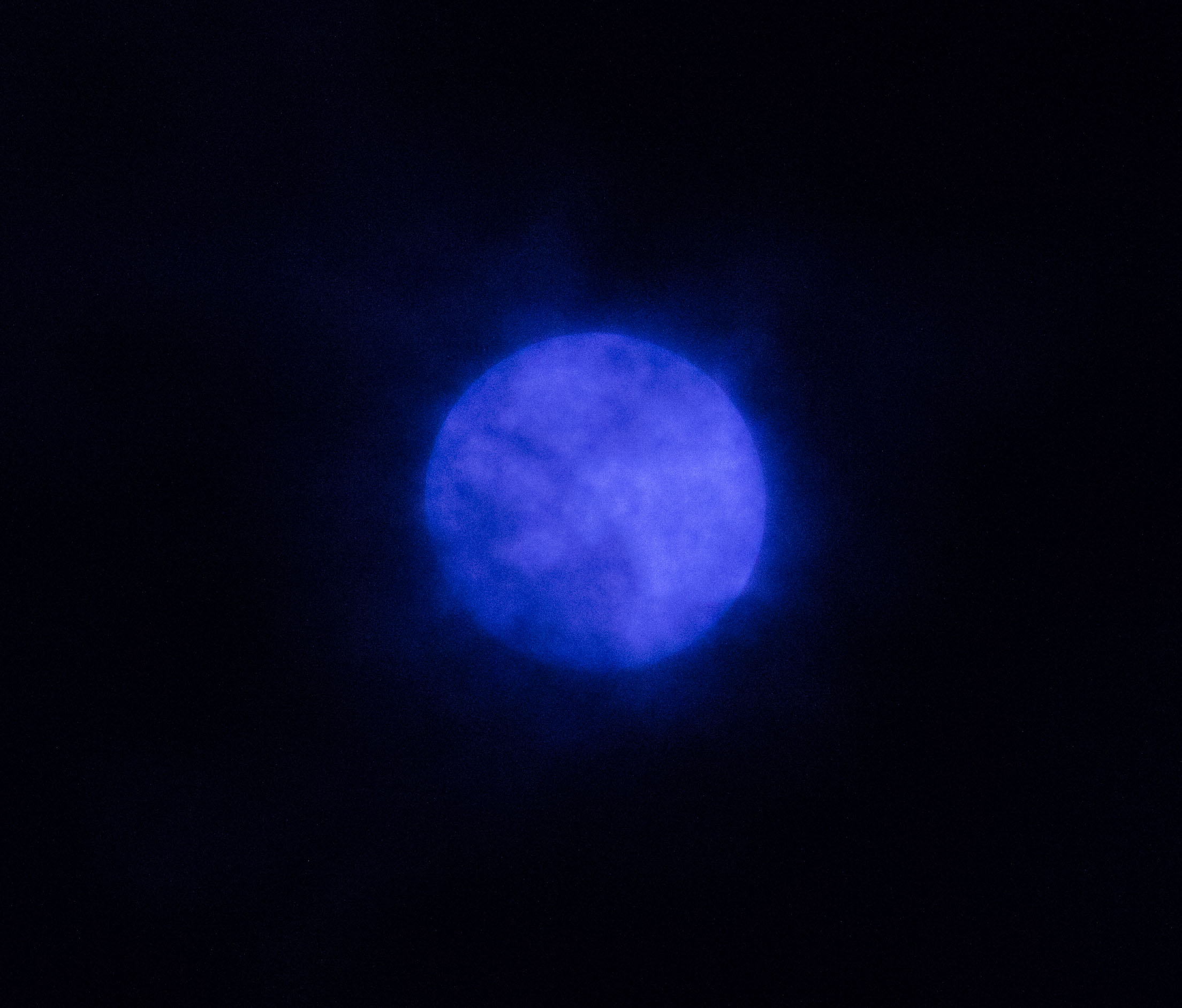
This photo is cropped in of the moon and I decided to insert color in the photo. The blue makes it look almost like a supernova in space.
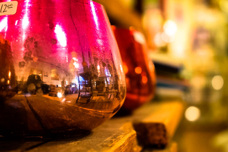

This image was taken at the Bangor Rock and Art shop, I used Lightroom to really make the colors pop and make the photo feel warm.
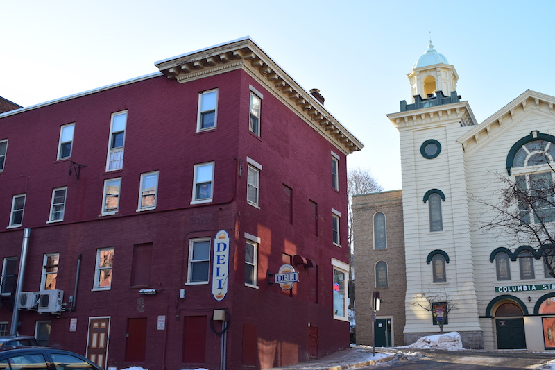
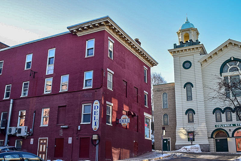
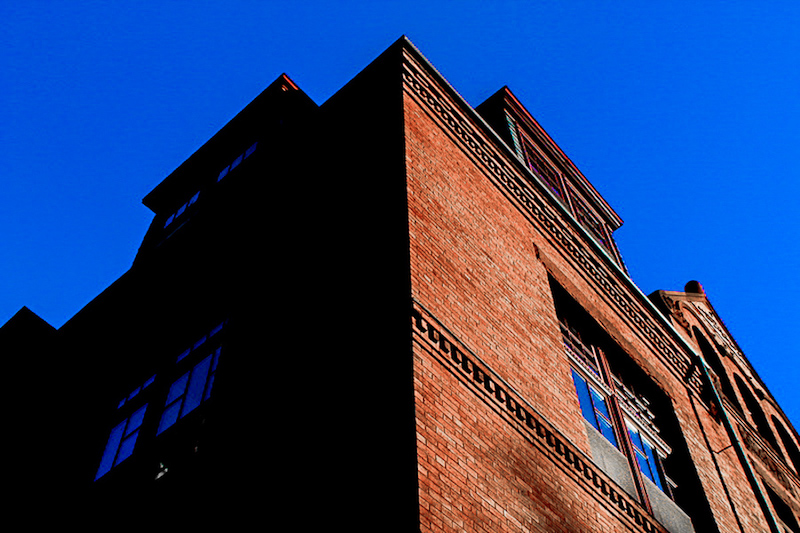
This was a shot of downtown Bangor, I wanted to take the photo and make it look a little older and more detailed.
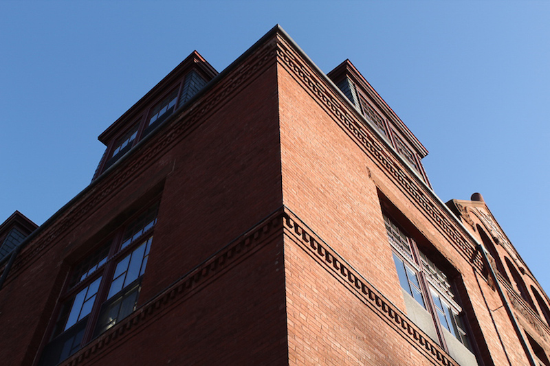
This was another shot in downtown Bangor, I used Lightroom to make the photo feel a bit brighter.

The photo was dull before, so I used some editing to make the colors come out a bit more.
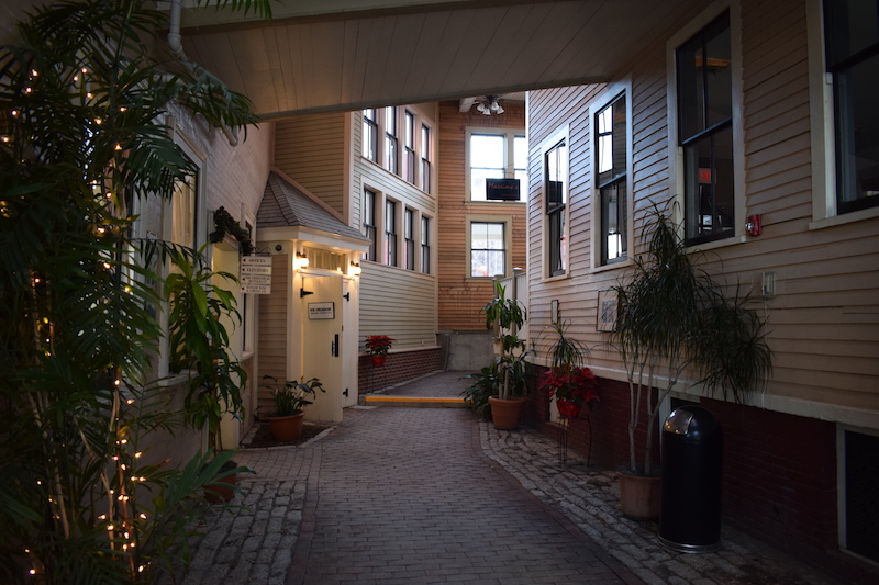
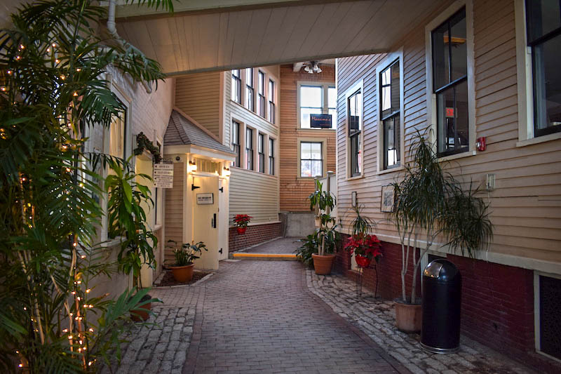
This was a favorite image of mine from downtown, I used editing to make the light seem a bit more interesting. Unfortunately, it seems like Lightroom affected the quality of some of the pictures.
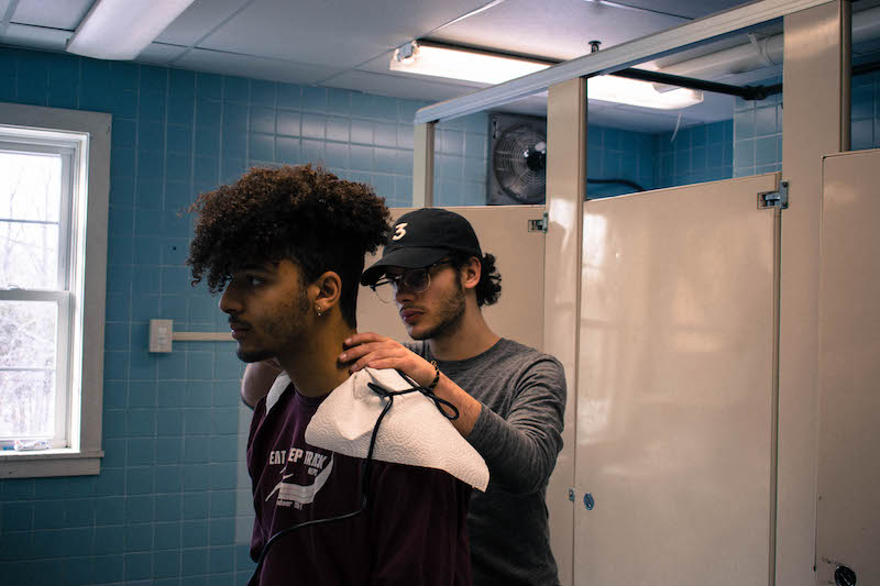
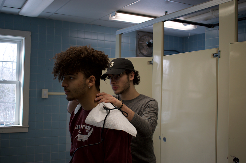
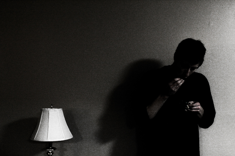
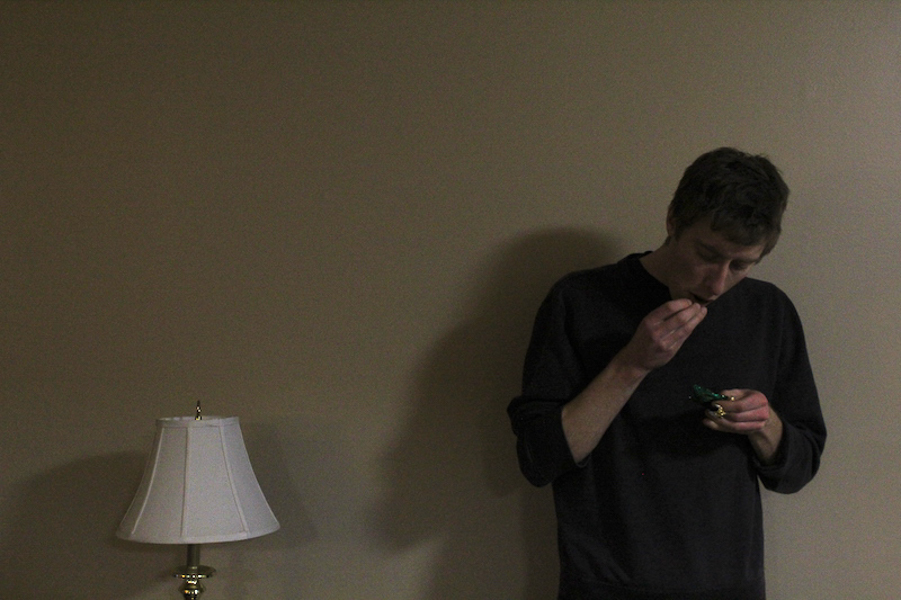
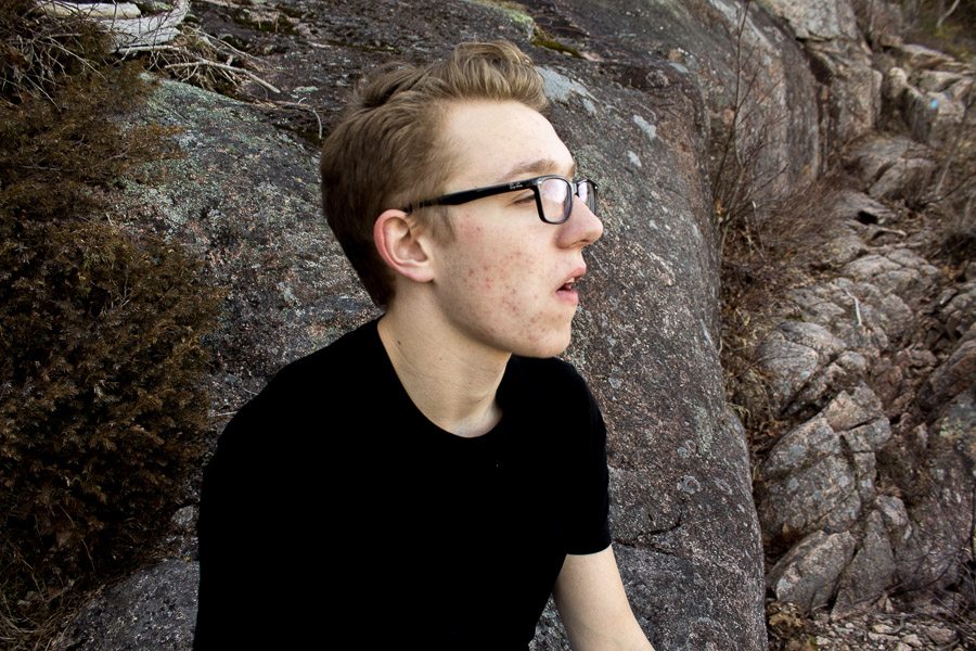
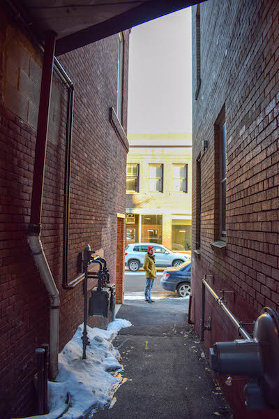
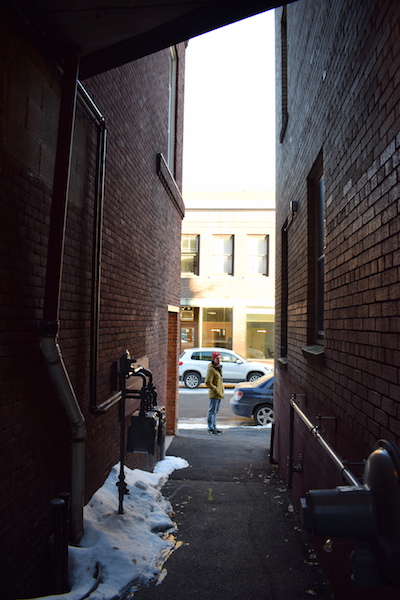
This was a photo I made using a tripod while I cut my friends hair. I decided to use Lightroom to try and make the photo make a little bit more interesting.
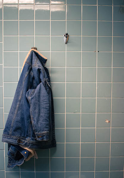
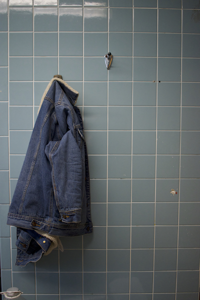
My jacket hung up on a wall, I used Lightroom to try and show the differences of blues in my jacket and the wall.

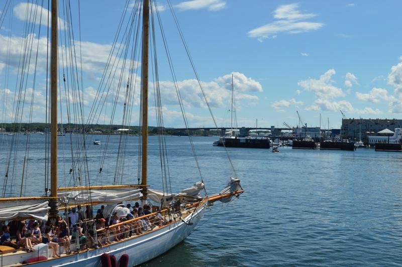
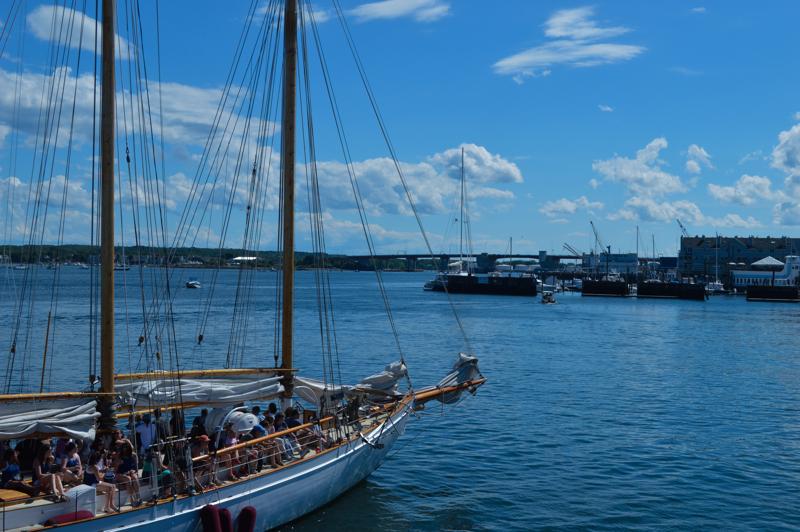
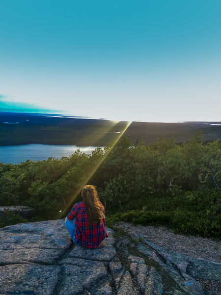
This is one of my favorite photos I took from a day trip to Bar Harbor. I just think all the colors blend very interestingly.
This was the first edit I did. My sister asked for her picture to be taken on a sunny day and I always have liked how it came out.
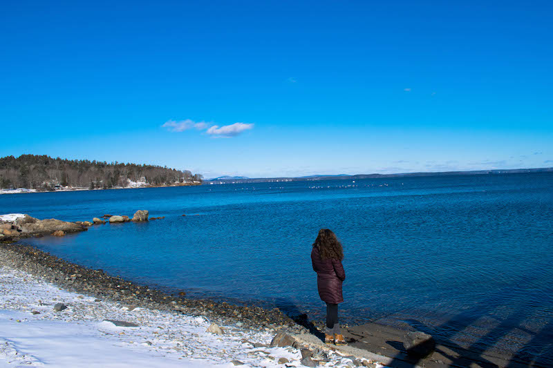
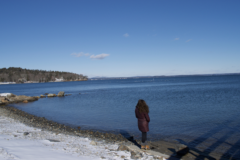
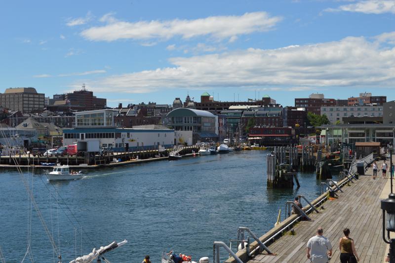
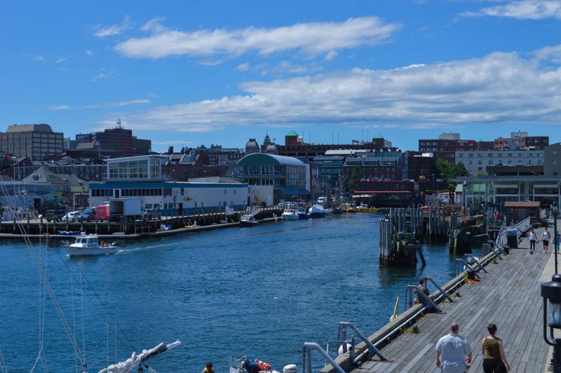
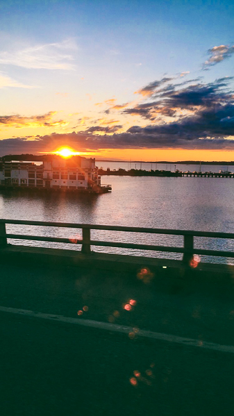
The last photo is another from my day trip to Bar Harbor. I used editing to really make the blue of the sky and ocean pop.